Color Image Segmentation

IN colored images, color per pixel I can referred to as the sum of RGB or

I = R + G + B

We can normalize this by dividing the whole equation by I and expressing the RGB terms as r = R/I, g = G/I, b = B/I.  Giving

1 = r + g + b

In color image segmentation, a region of interest (ROI) is selected from the image such that further processing can be done on it.  Segmentation is hard to do on grayscale images since upon conversion, the region of interest will just have the same grayscale values as the background.  Color segmentation is easier to perform in segmenting images which is plausibly applicable in face and hand recognition, remote sensing, and microscopy.  Inherently, 3D objects will have shading variations. To some extent shadows can be seen as differing brightness levels of the same color. For this reason, it is better to represent color space not by the RGB but by one that can separate brightness and chromaticity (pure color) information. One such color space is thenormalized chromaticity coordinates or NCC.

Figure 1. Normalized chromaticity space. X-axis is r and y-axis is g

Previously, we say that r+g+b = 1 which implies r,g and b canonly have values between 1 and 0 and b is dependenton r and g since b = 1-r-g. Therefore, it is enough to represent chromaticity by just two coordinates, r and g. Thus, from R G B, the color space has beentransformed to r g I where chromatic information is in r and g while brightness information is in I. We have thus reduced color information from 3 dimensions to2. Thus, when segmenting 3D objects it is better tofirst transform RGB into rgI Figure 2 shows the r-g color space. When r and g areboth zero, b = 1. Therefore, the origin corresponds to blue while pointscorresponding to r=1 and g=1 are points of pure red and green, respectively. Any color therefore can be represented as a point in NCC space. Thus the pixel chromaticities of a red image will only occupy a small blob in the red region regardless of its shading variation.

Two probability distribution estimations are used in the color segmentation in this activity; Parametric and Non-parametric.  Segmentation based on color can be performed by determining the probabilitythat a pixel belongs to a color distribution of interest. Thus, a color histogram must be made first from a cropped subregion of the ROI.  The histogram whennormalized by the number of pixels is already the probability distribution function(PDF) of the color. To tag a pixel as belonging to a region of interest or not is tofind its probability of belonging to the color of the ROI.

Since our space is r and g, we can have a joint probability p(r) p(g) function to test the likelihood of pixelmembership to the ROI. We can assume a Gaussian distribution independently along r and g, that is, from the r-g values of the cropped pixel we compute the mean μr ,μg and standard deviation σr ,σg from the pixel samples. The probability that a pixel with chromaticity r belongs to the ROI is then
A similar equation is computed for g. The joint probability is taken as the product of  p(r) and p(g).
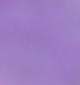
For this activity, single colored images, were chosen.  Below is an image of a purple flower.

Figure 2. Color Image used

A small subregion was cropped from the ROI…

The 2 estimations were then performed on the ROI.

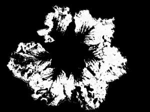
Parametric segmentation – derive the Gaussian PDF in the r and g values separately of the ROI and segment the whole image.

Figure 3. Segmented image using Parametric estimation

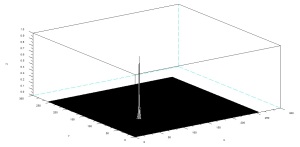
Non-parametric segmentation – Obtain the 2D histogram of the ROI. Use the histogram itself to segment the image using histogram backprojection.

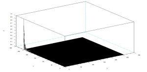
Figure 4. Histplot of the ROI

Figure 5. Segmented image using Non-Parametric estimation

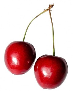
The next image is a cherry obtained from the web.

Source: http://www.public-domain-image.com/flora-plants-public-domain-images-pictures/fruits-public-domain-images-pictures/cherry-fruit-pictures/cherry-fruit-on-white-background.jpg.html

The same principle as the color segmentation in the flower was done.

Figure 6. Color Image used

Figure 7. Segmented image using Parametric estimation

Figure 8. Histplot of the ROI

Figure 9. Segmented image using Non-Parametric estimation

Comparing the two estimations, I can say that their only difference is that the area of the segmentation using Parametric estimation is bigger than that of the non-parametric, thus it can be treated as the better, since it can account more pixel given the same monochromatic subregion.

I give myself a grade of 10 for providing all the necessary stuffs.

References:

1.     M. Soriano. Color Image Segmentation. Applied Physics 187.2010.

Index

Code Used:

chdir('C:\Users\Rob H. Entac\Documents\Acads\1st Semester 10-11\App Phy 186\Act 13');

stacksize(100000000);

image = imread('cherry.jpg');

I = imread('cROI.jpg');

R = I(:,:,1);

G = I(:,:,2);

B = I(:,:,3);

RGB = R + G + B;

r = R./RGB;

b = B./RGB;

g = G./RGB;

Ri = image(:,:,1);

Gi = image(:,:,2);

Bi = image(:,:,3);

RGBi = Ri + Gi + Bi;

RGBi(find(RGBi==0)) = 1000000;

ri = Ri./RGBi;

bi = Bi./RGBi;

gi = Gi./RGBi;

// Parametric Segmentation

rmean = mean(r);

gmean = mean(g);

rsigma = stdev(r);

gsigma = stdev(g);

rp = (1/(rsigma*sqrt(2*%pi)))*exp(-((ri - rmean).^2)/(2*rsigma^2));

gp = (1/(gsigma*sqrt(2*%pi)))*exp(-((gi - gmean).^2)/(2*gsigma^2));

rgp = round(rp.*gp);

scf(0);

imshow(rgp);

imwrite(rgp, 'cherry parametric segment.jpg');

// Non-parametric Segmentation

// 2D Histogram Plot

BINS = 256;

rint = round(r*(BINS - 1) + 1);

gint = round(g*(BINS - 1) + 1);

colors = gint(:) + (rint(:) - 1)*BINS;

hist = zeros(BINS, BINS);

for row = 1:BINS

  for col = 1:(BINS - row + 1)

    hist(row, col) = length(find(colors == (((col + (row - 1)*BINS)))));

  end

end

histo = hist/max(hist);

scf(1);

mesh(histo);

// Backprojection

rib = ri*255;

gib = gi*255;

[a, b] = size(image);

segment = zeros(a, b);

for i = 1:a

  for j = 1:b

    c = round(rib(i, j)) + 1;

    d = round(gib(i, j)) + 1;

    segment(i, j) = hist(c, d);

  end

end

scf(2);

imshow(segment);

imwrite(segment, 'cherry nonparametric segment.jpg');

Color Camera Processing

Colored digital image is an array of pixels each having red, green and blue light overlaid in various proportions.  In color science, the color captured per pixel by a digital color camera is an integral of the product of the spectral power distribution of the incident light source S(λ), the surface reflectance ρ(λ)  and the spectral sensitivity of the camera η(λ).  For RGB, the spectral sensitivities are given by ηR(λ), ηG(λ), and ηB(λ).

R= KRΣρ(λ)S(λ)ηR(λ) (1)
G= KGΣρ(λ)S(λ)ηG(λ)      (2)
B= KBΣρ(λ)S(λ)ηB(λ)      (3)
where
Ki= 1/ΣS(λ)ηi(λ)                  (4)
is a balancing constant equal to the inverse of the camera output when shown a white object (r(l) = 1.0). Equations (1) to (4) explain why sometimes the colors captured by a digital camera appear unsatisfactory [1].
White balance (WB) is the process of removing unrealistic color casts, so that objects which appear white in person are rendered white in your photo.  Proper camera white balance has to take into account the “color temperature” of a light source, which refers to the relative warmth or coolness of white light.  Our eyes are very good at judging what is white under different light sources, however digital cameras often have great difficulty with auto white balance (AWB).  An incorrect WB can create unsightly blue, orange, or even green color casts, which are unrealistic and particularly damaging to portraits.  Performing WB in traditional film photography requires attaching a different cast-removing filter for each lighting condition, whereas with digital this is no longer required.  Understanding digital white balance can help you avoid color casts created by your camera’s AWB, thereby improving your photos under a wider range of lighting conditions” [2]

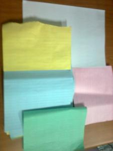
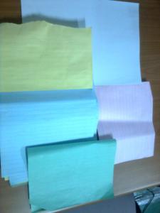
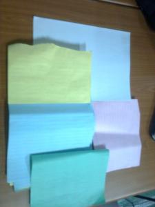
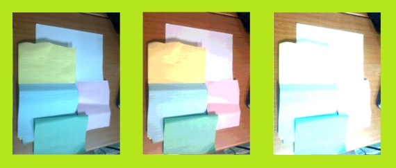
In color cameras, White Balance can be chosen depending on the condition when the image was taken.  The following are images with different White Balances; automatic, daylight, fluorescent and incandescent.

Figure . Image with automatic white balancing

Figure . Image with Daylight White Balance

Figure . Image with Fluorescent White Balance

Figure . Image with Incandescent White Balance

Automatic White Balancing Algorithms

There are two popular algorithms of achieving automatic white balance. The first is the White Patch Algorithm and the second is the Gray World Algorithm. If you look carefully at equations (1) to (3) these are just the raw camera outputs divided by the camera output for a white object. So the key is to determine what the camera output is for a white object. In the White Patch Algorithm, you capture an image using an unbalanced camera and use the RGB values of a known white object as the divider. In the Gray World Algorithm, it is assumed that the average color of the world is gray. Gray is part of the family of white, as is black. Therefore, if you know the RGB of a gray object, it is essentially the RGB of white times a constant factor. Thus, to get the balancing constants, you take the average red, green and blue value of the captured image and utilize them as the balancing constants. [1]

In implementing the White Patch Algorithm, a “white patch” on the image was cropped.  This white is not necessarily white in the image, because of course of the inconsistencies in the white balancing, but is the white object when the image was taken.

For the fluorescent white balance, the white patch cropped is shown below.

Figure . White Patch used for Fluorescent

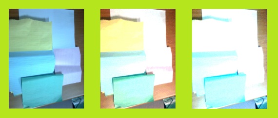
For the 2 white balancing algorithm used, the results are shown below.

Figure (a) Image with Fluorescent White Balance, and Numerical White Balance using (b) White Patch Algorithm (c) Gray World Algorithm

Let’s also see the effect of implementing the White Balance Algorithms in the image with incandescent white balancing.  The image below is what is white in the image.

Figure . White Patch used for Incandescent

The results for the 2 white balancing algorithms implemented are shown below.

Figure (a) Image with Incandescent White Balance, and Numerical White Balance using (b) White Patch Algorithm (c) Gray World Algorithm

Based from the results, it can be observed that the 2 white balancing algorithms do contain strengths and weaknesses in white balancing images.  The Gray World algorithm do made the white appear more white but it didn’t restrict itself to just doing so in the white portion of the image, the whole image became whiter as well to the point that colors became quite indiscernible.  On the other hand, the White Patch Algorithms’ white is not that white but the image do appear better in terms of discernibility of the colors.  So, I think the latter algorithm is better.

I rate myself a grade of 10 for this activity for providing all the necessary outputs.

References:

1.    M. Soriano.  Color Camera Processing.  Applied Physics 187.2010

2.    White Balancing.  http://www.cambridgeincolour.com/tutorials/white-balance.htm

Index

Code Used:

chdir('C:\Users\Rob H. Entac\Documents\Acads\1st Semester 10-11\App Phy 186\Act 12'); 

stacksize(100000000);

I = imread('Image0138.jpg');

R = I(:,:,1);

G = I(:,:,2);

B = I(:,:,3);

// White Patch Algorithm

white_patch = imread('Incandescent Patch.jpg');

Rw = sum(white_patch(:,:,1))/length(white_patch(:,:,1));

Gw = sum(white_patch(:,:,2))/length(white_patch(:,:,2));

Bw = sum(white_patch(:,:,3))/length(white_patch(:,:,3));

nR = R/Rw;

nG = G/Gw;

nB = B/Bw;

nR(find(nR > 1)) =1;

nG(find(nG > 1)) =1;

nB(find(nB > 1)) =1;

newI = [];

newI(:,:,1) = nR;

newI(:,:,2) = nG;

newI(:,:,3) = nB;

scf(1);

imshow(newI);

imwrite(newI/max(newI), 'IWPA.jpg');

// Gray World Algorithm

Rgray = sum(R)/length(R);

Ggray = sum(G)/length(G);

Bgray = sum(B)/length(B);

ngrayR = R/Rgray;

ngrayG = G/Rgray;

ngrayB = B/Rgray;

ngrayR(find(ngrayR > 1)) =1;

ngrayG(find(ngrayG > 1)) =1;

ngrayB(find(ngrayB > 1)) =1;

newI = [];

newI(:,:,1) = ngrayR;

newI(:,:,2) = ngrayG;

newI(:,:,3) = ngrayB;

scf(2);

imshow(newI);

imwrite(newI/max(newI), 'IGWA.jpg');

Binary Operations

Its Activity 10! one & zero – coincidentally we’re doing Binary Operations 🙂

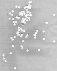
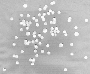
One extensive application of image processing is on the detection and differentiation of malignant/cancer cells from normal cells.  This is in line with fact that abnormal cells would tend to have varied size from the normal, healthy cells.  Thus, it is important to implement a mechanism on measuring the area of a cell given an image.  However, in real terms, this is not as simple as it sounds, since ideally cells don’t just isolate themselves from the whole bunch of other cells; it should be expected that in a two-dimensional picture, cells might end up coinciding or overlapping with other cells, furtheremore, complicating the segmentation of the region of interest (ROI) from the background.

Figure 1. Simulated Cells using Punched papers

In image processing, this is done by binarizing the image with careful consideration of the image’s graylevel histogram for thresholding. Furtheremore, closing and opening operators would be used to close the holes left and to separate overlapping cells. Morphological operations discussed in the previous activity will be used in implementing the closing and opening operators.

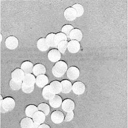
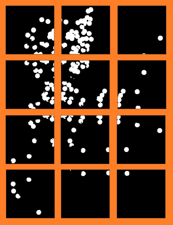
In this activity, simulations of cells are made from punched papers scattered on a background.  The image of this simulation was first cut into 12 parts and the analysis was done on each subimage individually.  This is yet another simulation of the fact that in actual cancer screening several samples from one subject are taken.  Estimate of the area of a normal cell can be deduced from this with careful consideration of the statistics.

Figure 2. Subimage of the original simulated cells

For this particular subimage, the histplot is shown below.

Figure 3. Histplot of the above subimage

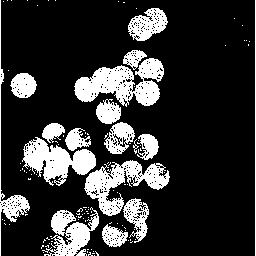
From the histplots of the subimages, the threshold was chosen for binarizing the subimages.

Figure 4. Binarized subimage

However, even with proper thresholding, the binarization is still unsatisfactory in segmenting the ROI.  Thus, the binarized images of the subimages are further enhanced through isolation of blobs using opening and closing operator.  In Scilab, the closing and opening operators are performed using repititive applications of dilation and erosion with a definite structuring element.  The code for this process is shown below (See Index)

Figure 5. The 12 subimages after binarization, application of closing and opening and closing, recombined.

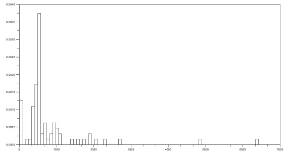
For the measurement of the area of each contiguous blob, the bwlabel command was first used each blob in the binarized image.  The area was measured for each blob, in number of pixels, and the average area and the standard deviation were computed.

Figure 6.  Histogram of all areas detected in the processed image.
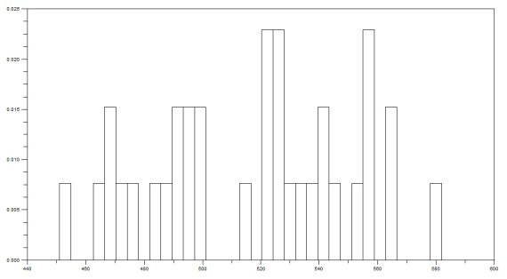
Figure 7.  Histogram of areas with no overlaps

An estimate of the area was found to be 516.88235±34.267013.

A second image was given for the detection of the cancer cells from the surrounding “normal-sized” normal cells. Initially, the obviously bigger cells were isolated from the rest of the image and their corresponding areas are measured using the same measuring principle employed in the area measurement of the normal cells.

Figure 8.  Simulated cells with some cells larger than the other
Figure 9.  Segregated bigger cell

The area of this “cancer cell” is measured and the areas of the blob in the binarized image are compared with a set range of area that this measured area lies.  From here,  blobs which do not lie in the range are erased in the image.

Figure 10. Segregated Cancer Cells

This is activity 10, and I also have 10 figures, I might as well rate myself a grade of 10 for this activity for providing all the required outputs.

References:

1.     M. Soriano.  Binary Operations. Applied Physics 186. 2010.

Index:

Code used:

chdir(‘C:\Users\Rob H. Entac\Documents\Acads\1st Semester 10-11\App Phy 186\Act 10’);
stacksize(100000000);
SE = ones(3,3);
SE = mkfftfilter(SE,’binary’,7);
area = [];
counter = 1;
for i =1:12;
I = gray_imread(‘C_’+string(i)+’.jpg’);
I = im2bw(I, 210/255);
I = erode(I,SE);
I = dilate(I,SE);
I = dilate(I,SE);
I = erode(I,SE);
scf(i);
imshow(I);
//imwrite(I/max(I), ‘CB_’+string(i)+’.jpg’);
[L,n] = bwlabel(I);
for j =1:n;
area(counter) = length(find(L==j));
counter=counter+1;
end
end
scf(13);
histplot(length(area),area);
cells = find(area<600 & area>450);
scf(14);
histplot(length(cells), area(cells));
all_cells = area(cells);
ave_area = sum(all_cells)/length(cells)
stdev_area = stdev(area(cells))

Morphological Operations

Morphology is a broad set of image processing operations that process images based on shapes. Morphological operations apply a structuring element to an input image, creating an output image of the same size. In a morphological operation, the value of each pixel in the output image is based on a comparison of the corresponding pixel in the input image with its neighbors. By choosing the size and shape of the neighborhood, you can construct a morphological operation that is sensitive to specific shapes in the input image.

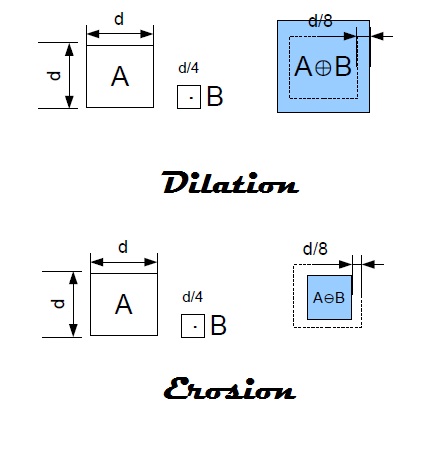
The most basic morphological operations are dilation and erosion. Dilation adds pixels to the boundaries of objects in an image, while erosion removes pixels on object boundaries. The number of pixels added or removed from the objects in an image depends on the size and shape of the structuring element used to process the image. In the morphological dilation and erosion operations, the state of any given pixel in the output image is determined by applying a rule to the corresponding pixel and its neighbors in the input image. ” [1]

Rules for Padding Images [1]

Operation Rule
Dilation Pixels beyond the image border are assigned the minimum value afforded by the data type.For binary images, these pixels are assumed to be set to 0. For grayscale images, the minimum value for uint8images is 0.
Erosion Pixels beyond the image border are assigned the maximum value afforded by the data type.For binary images, these pixels are assumed to be set to 1. For grayscale images, the maximum value for uint8images is 255.


Dilation and Erosion can be easily implemented in Scilab for an image given specific structuring elements (strels). Specifically, the commands are dilate(im,strel,[center]) and erode(im,strel,[center]).

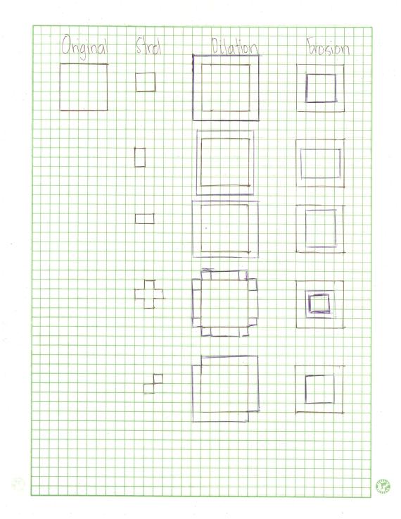
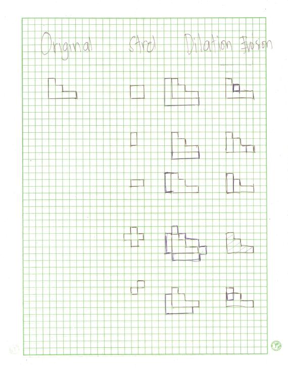
The first part of the activity is predicting the resulting erosion and dilation of different images with different structuring elements.  The images used are:

1. A 5×5 square
2. A triangle, base = 4 boxes, height = 3 boxes
3. A hollow 10×10 square, 2 boxes thick
4. A plus sign, one box thick, 5 boxes along each line.
While the strels used are:
1. 2×2 ones
2. 2×1 ones
3. 1×2 ones
4. cross, 3 pixels long, one pixel thick.
5. A diagonal line, two boxes long, i.e. [0 1:1 0] .
The predictions are done manually in graphing papers and were scanned thereafter.  The predictions are shown below:

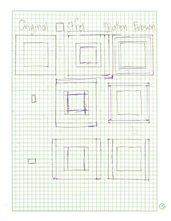
Figure 1. Predictions for the Dilation and Erosion of a Square with different structuring elements

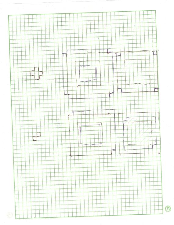
Figure 2. Predictions for the Dilation and Erosion of a triangle with different structuring elements

Figure 3. Predictions for the Dilation and Erosion of a hollow square with different structuring elements

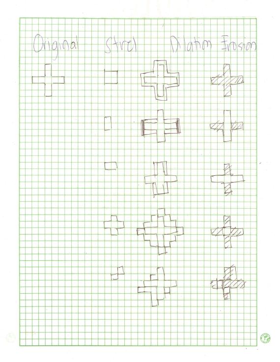
Figure 4. Predictions for the Dilation and Erosion of a plus with different structuring elements

After the predictions, the dilation and erosion are implemented in Scilab using the code below (see Index).  The results are shown below.  The original images are places at the upper portion whereas the strels are at the leftmost side. For the Dilation:

Figure 5. Results of Dilation of different shapes with different structuring elements

Figure 6. Results of Erosion of different shape with different structuring elements

Other morphological operations are also explored in this activity like thin and skel.  These two are easier to implement since they don’t need structuring elements unlike dilation and erosion.  The results are shown below.

Figure 7. Results of applying thin and skel on the shapes previously used

I would like to give myself a grade of 10 for doing all the required things and for following the instructions. 🙂

References:

1.     Morphology Fundamentals:Dilation and Erosion.  <http://www.mathworks.com/help/toolbox>

2.     M. Soriano.  Morphological Operations. Applied Physics 186.2010

Index

Code Used:

chdir(‘C:\Users\Rob H. Entac\Documents\Acads\1st Semester 10-11\App Phy 186\Act 9’);

//Original Image

S=zeros(13,13);//Square

S(5:9,5:9)=1;

T=zeros(13,13);//Triangle

T(6:8,6)=1;

T(7:8,7)=1;

T(8,8)=1;

T(8,9)=1;

H=zeros(14,14);//Hollow

H(3:12,3:4)=1;

H(3:4,5:10)=1;

H(11:12,5:10)=1;

H(3:12,11:12)=1;

P=zeros(13,13);//Plus

P(7,5:6)=1;

P(5:9,7)=1;

P(7,8:9)=1;

//Structuring Elements

A=zeros(13,13);//2×2

A(6:7,6:7)=1;

B=zeros(13,13);//2×1

B(6:7,7)=1;

C=zeros(13,13);//1×2

C(7,6:7)=1;

cross=zeros(13,13);//cross

cross(7,6)=1;

cross(6:8,7)=1;

cross(7,8)=1;

diagonal=zeros(13,13);//diagonal

diagonal(6,8)=1;

diagonal(7,7)=1;

//Dilation

scf(1);

D = imread(‘Dilation.jpg’);

subplot(6,5,1);

imshow(D);

subplot(6,5,2);

imshow(S,[]);

subplot(6,5,3);

imshow(T,[]);

subplot(6,5,4);

imshow(H,[]);

subplot(6,5,5);

imshow(P,[]);

subplot(6,5,6);

imshow(A,[]);

subplot(6,5,7);

SdilA = dilate(S,A,[7,7]);

imshow(SdilA,[]);

subplot(6,5,8);

TdilA = dilate(T,A,[7,7]);

imshow(TdilA,[]);

subplot(6,5,9);

HdilA = dilate(H,A,[7,7]);

imshow(HdilA,[]);

subplot(6,5,10);

PdilA = dilate(P,A,[7,7]);

imshow(PdilA,[]);

subplot(6,5,11);

imshow(B,[]);

subplot(6,5,12);

SdilB = dilate(S,B,[7,7]);

imshow(SdilB,[]);

subplot(6,5,13);

TdilB = dilate(T,B,[7,7]);

imshow(TdilB,[]);

subplot(6,5,14);

HdilB = dilate(H,B,[7,7]);

imshow(HdilB,[]);

subplot(6,5,15);

PdilB = dilate(P,B,[7,7]);

imshow(PdilB,[]);

subplot(6,5,16);

imshow(C,[]);

subplot(6,5,17);

SdilC = dilate(S,C,[7,7]);

imshow(SdilC,[]);

subplot(6,5,18);

TdilC = dilate(T,C,[7,7]);

imshow(TdilC,[]);

subplot(6,5,19);

HdilC = dilate(H,C,[7,7]);

imshow(HdilC,[]);

subplot(6,5,20);

PdilC = dilate(P,C,[7,7]);

imshow(PdilC,[]);

subplot(6,5,21);

imshow(cross,[]);

subplot(6,5,22);

Sdilcross = dilate(S,cross,[7,7]);

imshow(Sdilcross,[]);

subplot(6,5,23);

Tdilcross = dilate(T,cross,[7,7]);

imshow(Tdilcross,[]);

subplot(6,5,24);

Hdilcross = dilate(H,cross,[7,7]);

imshow(Hdilcross,[]);

subplot(6,5,25);

Pdilcross = dilate(P,cross,[7,7]);

imshow(Pdilcross,[]);

subplot(6,5,26);

imshow(diagonal,[]);

subplot(6,5,27);

Sdildiagonal = dilate(S,diagonal,[7,7]);

imshow(Sdildiagonal,[]);

subplot(6,5,28);

Tdildiagonal = dilate(T,diagonal,[7,7]);

imshow(Tdildiagonal,[]);

subplot(6,5,29);

Hdildiagonal = dilate(H,diagonal,[7,7]);

imshow(Hdildiagonal,[]);

subplot(6,5,30);

Pdildiagonal = dilate(P,diagonal,[7,7]);

imshow(Pdildiagonal,[]);

//Erosion

scf(2);

E = imread(‘Erosion.jpg’);

subplot(6,5,1);

imshow(E);

subplot(6,5,2);

imshow(S,[]);

subplot(6,5,3);

imshow(T,[]);

subplot(6,5,4);

imshow(H,[]);

subplot(6,5,5);

imshow(P,[]);

subplot(6,5,6);

imshow(A,[]);

subplot(6,5,7);

SeroA = erode(S,A,[7,7]);

imshow(SeroA,[]);

subplot(6,5,8);

TeroA = erode(T,A,[7,7]);

imshow(TeroA,[]);

subplot(6,5,9);

HeroA = erode(H,A,[7,7]);

imshow(HeroA,[]);

subplot(6,5,10);

PeroA = erode(P,A,[7,7]);

imshow(PeroA);

subplot(6,5,11);

imshow(B,[]);

subplot(6,5,12);

SeroB = erode(S,B,[7,7]);

imshow(SeroB,[]);

subplot(6,5,13);

TeroB = erode(T,B,[7,7]);

imshow(TeroB,[]);

subplot(6,5,14);

HeroB = erode(H,B,[7,7]);

imshow(HeroB,[]);

subplot(6,5,15);

PeroB = erode(P,B,[7,7]);

imshow(PeroB,[]);

subplot(6,5,16);

imshow(C,[]);

subplot(6,5,17);

SeroC = erode(S,C,[7,7]);

imshow(SeroC,[]);

subplot(6,5,18);

TeroC = erode(T,C,[7,7]);

imshow(TeroC,[]);

subplot(6,5,19);

HeroC = erode(H,C,[7,7]);

imshow(HeroC,[]);

subplot(6,5,20);

PeroC = erode(P,C,[7,7]);

imshow(PeroC,[]);

subplot(6,5,21);

imshow(cross,[]);

subplot(6,5,22);

Serocross = erode(S,cross,[7,7]);

imshow(Serocross,[]);

subplot(6,5,23);

Terocross = erode(T,cross,[7,7]);

imshow(Terocross);

subplot(6,5,24);

Herocross = erode(H,cross,[7,7]);

imshow(Herocross,[]);

subplot(6,5,25);

Perocross = erode(P,cross,[7,7]);

imshow(Perocross,[]);

subplot(6,5,26);

imshow(diagonal,[]);

subplot(6,5,27);

Serodiagonal = erode(S,diagonal,[7,7]);

imshow(Serodiagonal,[]);

subplot(6,5,28);

Terodiagonal = erode(T,diagonal,[7,7]);

imshow(Terodiagonal,[]);

subplot(6,5,29);

Herodiagonal = erode(H,diagonal,[7,7]);

imshow(Herodiagonal,[]);

subplot(6,5,30);

Perodiagonal = erode(P,diagonal,[7,7]);

imshow(Perodiagonal,[]);

//Thin and Skel

scf(3);

Th = imread(‘Thin.jpg’);

Sk = imread(‘Skel.jpg’);

subplot(532);

imshow(Th);

subplot(533);

imshow(Sk);

subplot(534);

imshow(S,[]);

subplot(535);

ST = thin(S);

imshow(ST);

subplot(536);

SS = skel(S);

imshow(SS);

subplot(537);

imshow(T,[]);

subplot(538);

TT = thin(T);

imshow(TT);

subplot(539);

TS = skel(T);

imshow(TS);

subplot(5,3,10);

imshow(H,[]);

subplot(5,3,11);

HT = thin(H);

imshow(HT);

subplot(5,3,12);

HS = skel(H);

imshow(HS);

subplot(5,3,13);

imshow(P,[]);

subplot(5,3,14);

PT = thin(P);

imshow(PT);

subplot(5,3,15);

PS = skel(P);

imshow(PS);

Enhancement in the Fourier Domain

Images can be enhanced through manipulations in the frequency domain.  For unwanted patterns, enhancement can be made by masking the frequencies of the unwanted patterns.  On the other hand, desired frequencies can also be enhanced. Now that we already have knowledge on the properties and the manipulations possible with Fourier Transform (FT), we come now into using it in real image processing exercise.  Filter masks are done with careful considerations of Convolution Theorem.  We already know from previous exercise that the FT of a convolution of 2 functions in space is just the product of the FTs of the two functions.  Also, the convolution of a dirac delta and a function results in the replication of the function in the location of the dirac delta or in equation form [1];

∫ f (τ)δ(to−τ)d τ= f (to)

A.  Convolution Theorem

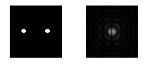
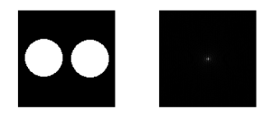
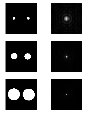
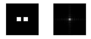
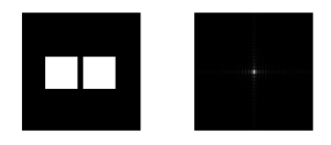
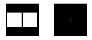
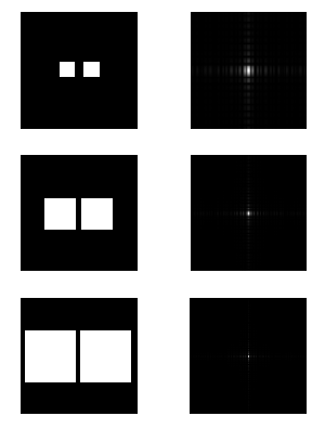
Let us now explore the Convolution Theorem further.  First we take the FT modulus of symmetric patterns (e.g. 2 dots, pairs of circles and squares with variable radii and dimensions, respectively).  These images were drawn in MS Paint, then exported to Scilab as grayscale images.  The FT modulus was obtained using the following code (This code was used for all exercises that utilizes  FT.)

chdir(‘C:\Users\Rob H. Entac\Documents\Acads\1st Semester 10-11\App Phy 186\Act 8’);
stacksize(100000000);
//Displaying FFT modulus
I = imread(‘2 dots.png’);
GI = im2gray(I);
scf(0);
subplot(121);
imshow(GI);
FFTGI = log(abs(fftshift(fft(GI))));
subplot(122);
imshow(FFTGI, []);

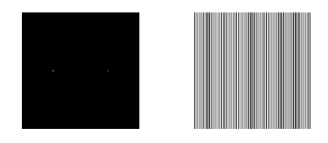
Figure 1. 2 Dots pattern with corresponding FT

Figure 2. Pairs of circles with varying radii and their corresponding FTs

Below is an animated gif showing the effect of changing the radii of the circles in the FT.  Please click the image to play…

Animated GIF of circles with varying radii with their correspoding FT

Figure 3. Pairs of Squares with varying dimensions and their corresponding FTs

Below is an animated gif showing the effect of changing the dimensions of the square in the FT.  Please click the image to play…

Animated GIF of Squares with varying dimensions and their corresponding FTs

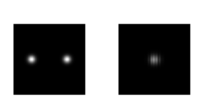
FT modulus of symmetric Gaussians were also obtained.  In equation form, Gaussians are represented by

exp(−( x±μo)^2/σ^2 )

The Gaussians of varying variance were obtained using the code below

//Gaussian
a = 100;
b = 100;
m = 0.5;
var = 0.5;//0.1,0.2,0.3,0.4,0.5
x = linspace(-1,1,a);
y = linspace(-1,1,b);
[X,Y] = meshgrid(x,y);
Gaussian = exp(-((X+m).*(X+m))/var^2).*exp(-(Y.*Y)/var^2) + exp(-((X-m).*(X-m))/var^2).*exp(-(Y.*Y)/var^2);
imshow(Gaussian, []);
imwrite(Gaussian/max(Gaussian), ‘Gaussian at 0.5.png’);

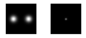
Figure 4. Gaussian with 0.1 variance and its corresponding FT

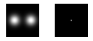
Figure 5. Gaussian with 0.2 variance and its corresponding FT

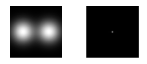
Figure 6. Gaussian with 0.3 variance and its corresponding FT

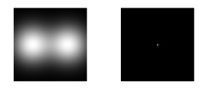
Figure 7. Gaussian with 0.4 variance with its corresponding FT

Figure 8. Gaussian with 0.5 variance and its corresponding FT

It can be seen from above images that as the variance of the Gaussian increases, the size of the corresponding FT decreases.

Now, we already have a clear grasp on the behavior of the FTs of different symmetric patterns and with variable dimensions.  What if we  extend our investigation with getting the FT of  multiple equally spaced dirac deltas?  We do this by creating an image of equally spaced 1s in an array of zeros.  Scattered throughout an array of zeros, these 1s can now be considered as dirac deltas.
The codes used;
B = zeros(nx,ny);
space = 10;//variable (10, 20,30)
for i =1:space:nx+1
for j =1:space:ny+1
B(i,j) = 1;
end;
end;
scf(2);
subplot(121);
imshow(B);
BFFT = abs(fftshift(fft2(B)));
subplot(122);
imshow(BFFT, []);
The FT for different spacing (10, 20, 30) are shown below,

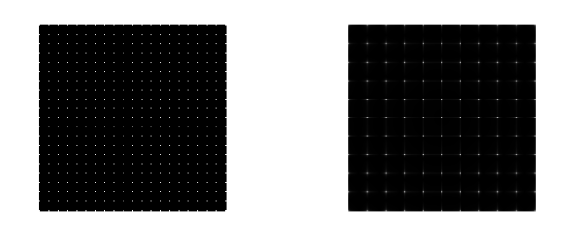
Figure 9. 1s with spacing equal to 10 and its corresponding FT

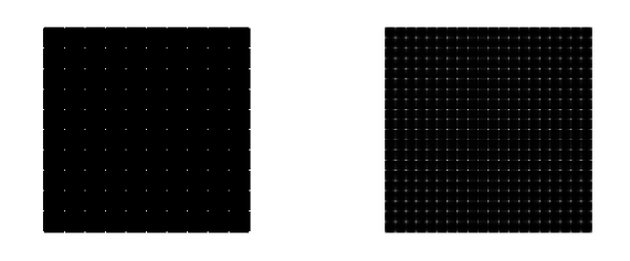
Figure 10. 1s with spacing equal to 20 and its corresponding FT

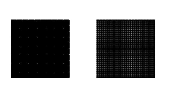
Figure 11. 1s with spacing equal to 30 and its corresponding FT

It can be observed that as the spacing is increased, the spacing of the frequencies in the FT modulus decreases.

Next we investigate the 2D convolution function in Scilab, imconv().  We used it  to convolve a 200 x 200 array of zeros with 10 random 1’s and an arbitrary 3 x 3 pattern.  Two patterns are used  for this activity; horizontal and vertical.

The random 1s  acting as dirac deltas will be  convolved  with the 2 patterns.  Shown below are the codes used and result of the convolution for both patterns.

nx = 200; ny = 200;
A = zeros(nx,ny);
while sum(A)<10
A(round(rand()*nx)+1, round(rand()*ny)+1) = 1;
end;
scf(1);
subplot(121);
imshow(A);
d = [-2 -2 -2;-1 -1 -1; -3 -3 -3];//horizontal pattern
//The vertical pattern used is [-2 -1 3; -2 -1 3; -2 -1 3]
C = imconv(A, d);
subplot(122);
imshow(C, []);

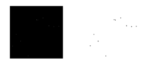
Figure 12. Convolution of random 1s with a horizontal pattern

Figure 13. Convolution of random 1s with a horizontal pattern

The above figures clearly demonstrated the unique characteristic of convolving an arbitrary pattern with dirac deltas. Previously, it was stated that the convolution of a pattern with a dirac delta would result to the replication of that pattern in the location of the dirac delta.  Here we can see that both the horizontal and vertical patterns do appear on the location of the random 1s.

B.  Fingerprint: Ridge Enhancement

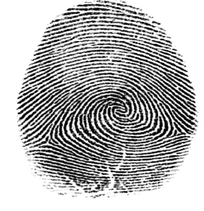
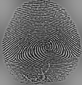
Well, since our subject is really on image processing, let’s apply what we’ve so far learned into enhancing images.    Previously, our enhancement is only done in the spatial domain, now that we already have enough (I assume) knowledge on the frequency domain, we can utilize it in enhancing some images.  First, we do the enhancement on an image of a finger print.  Raw fingerprint images do contain blotches and unnecessary inks aside from the finger print ridges that we can consider as noise.  In the frequency domain, we can block the frequency corresponding to these unnecessary signals and focus on the frequency of the fingerprint image.  Below is an unprocessed image (not yet binarized, I mean) of a fingerprint taken from the web.

Figure 14. Image of a fingerprint taken from the web

Fingerprint image taken from: http://www.theaviationnation.com/2008/02/19/dhs-10-fingerprints-from-foreigners-at-detroit-airport/

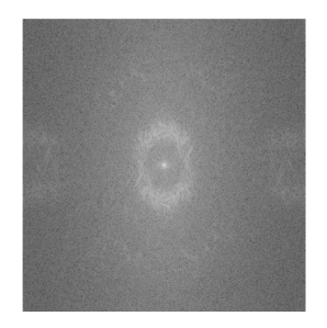
Now, we are going to invoke FT on our image for us to be “transported” to the other dimension which is the frequency domain.  First, we convert our image to grayscale and then take its FT modulus.    Here, we have to use the log scale since the FT modulus will take up several orders of magnitude.  The codes used and the resulting image of the FT modulus are shown below.

stacksize(10000000);
I = imread(‘Fingerprint.png’);
Igray = im2gray(I);
FFTIgray = log(abs(fftshift(fft2(Igray))));
scf(3);
imshow(FFTIgray, []);

Figure 15. FT modulus of the Fingerprint

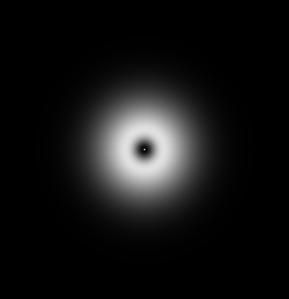
We can intuitively deduce that the necessary information to generate the fingerprint image from the FT is centralized on the bright annulus-like image in the center of the FT.  To capture this desired image, we have to create a filter that would only allow our desired region in the FT.  A Gaussian filter which also looks like an annulus was chosen to be used as a mask for this activity.

Figure 16. Gaussian Filter

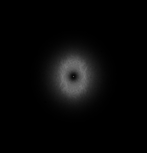
This filter was multiplied to the FT of the original FT, and the inverse FT of their product was taken to display the enhancement done.  The following code is used for this part

Mask = imread(‘Mask.png’);
Mgray = im2gray(Mask);
FFT = (Mgray).*(FFTIgray);
scf(5);
imshow(FFT, []);
imwrite(FFT/max(FFT), ‘product of FFTs.png’);
Filtered = abs((ifft(fftshift(Mgray).*fft2(Igray))));
scf(6);
imshow(Filtered, []);
imwrite(Filtered/max(Filtered), ‘Enhanced Fingerprint.png’);

Figure 17. Filtered FT using the Gaussian mask

Figure 18. Enhanced Fingerprint

Looking closely, the fingerprint ridges are now improved i.e. smoother and more refined.

C. Lunar Landing Scanned Pictures : Line Removal

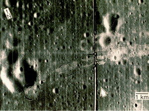
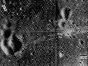
Now let’s widen our horizon further, this time doing the enhancement on an image of a landing site in the moon with an irregular vertical line on it.

Figure 19. Original image of the Lunar Landing site

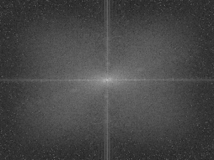
What seems to be not nice in this image is that vertical line (of course) that’s why it can be better if we can get rid of it.  Again, let’s do it by performing enhancement in the frequency domain.  Below is the FT of the grayscale version of our image.

Figure 20. FT of the grayscale image of the lunar landing site

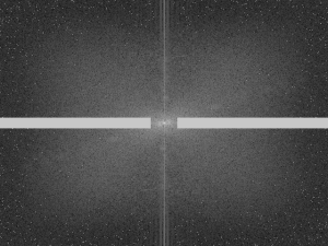
The cross-like image on the FT seems to be the prominent feature of the FT.  Since we are to eliminate one regular pattern in an image, it’s FT has to be also somewhat shaped regularly.  Looking back, we know that the FT of equally spaced lines is nothing but a line oriented perpendicular to the lines in the image. If we have to eliminate a horizontal line, we need to filter its corresponding frequency in the FT which has to be a vertical line.  And if we are to eliminate a vertical line, we need to filter also it’s corresponding horizontal line in the FT.  Now, let’s mask our FT…

Figure 21. Masked FT

Then again performing inverse FT…

Figure 22. Enhanced Image

Now, the vertical line is somewhat removed but I have to admit that there still remnants of it, which I think can’t be helped after trying to modify my filter (i.e. varying the dimensions).  Changing filter dimensions has some effects on the resolution of the enhanced image.  Also, using my code alone, I kept on producing rotated image which is definitely not solvable by fftshift.  To this, the rotate() command in Scilab can be utilized or manually rotate them in Windows Photo Viewer and just save the rotated image. The code used for the whole process:

chdir(‘C:\Users\Rob H. Entac\Documents\Acads\1st Semester 10-11\App Phy 186\Act 8’);
stacksize(100000000);
I = imread(‘lunar landing.png’);
Igray = im2gray(I);
FFTIgray = log(abs(fftshift(fft2(Igray))));
scf(1);
imshow(FFTIgray, []);
imwrite(FFTIgray/max(FFTIgray), ‘Lunar Landing FFT.png’);
//Mask
nx = 481;ny = 640;
x = linspace(-1,1,nx);
y = linspace(-1,1,ny);
[X,Y] = meshgrid(x,y);
mask = ones(nx,ny);
mask(find(abs(Y)>0.08)) = 0;
mask(find(abs(X)>0.045)) = 1
FFTEnMoon = log(abs(fftshift(fft2(Igray)).*mask)+0.08);
scf(2);
imshow(FFTEnMoon, []);
imwrite(FFTEnMoon/max(FFTEnMoon), ‘Enhanced Lunar Landing FFT.png’);
scf(3);
EnMoon = abs(fft2(fftshift(fft2(Igray)).*mask));
imshow(EnMoon, []);
imwrite(EnMoon/max(EnMoon), ‘Enhanced Lunar Landing.png’);

D.  Canvas Weave Modeling and Removal

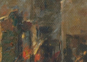
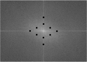
Another interesting and useful application of FT in image enhancement is the removal of canvas weave patterns in images of paintings (Figure 23).  Since these patterns are unavoidable in paintings in canvas, it somehow reduces details in paintings.  These patterns can be removed numerically by eliminating the corresponding frequency of the canvas.  In this section we do this by first taking the FT of the grayscale image (Figure 24).

Figure 23. Original Image of an oil Painting

Figure 24. FT of the grayscale image of the painting

From the above FT, we can see the bright spots corresponding to the frequency of the recurring patterns in the canvas.  Now, in the frequency domain, we can eliminate these patterns by masking these bright spots (Figure 23).

Figure 25. Masked FT

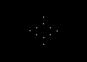
Before we perform the final step on enhancing our desired image, we have to first make sure that the frequency we have masked is really the corresponding frequency of the canvas weave.  We do this by taking the inverse of our mask…

Figure 26. Used Mask

and then take the inverse FT…

Figure 27. Inverse FT of the mask used showing the canvas weave patterns

Now, I can say that this image resembles a canvas (actually more resembles a place mat 🙂 ).

With the bright spots masked, we can now perform an inverse FT on it to reveal the enhanced image…

Figure 28. Enhanced Image

The following code is utilized in this section.

I = imread(‘canvasweave.jpg’);
Igray = im2gray(I);
FFTIgray = log(abs(fftshift(fft2(Igray))));
scf(4);
imshow(FFTIgray, []);
imwrite(FFTIgray/max(FFTIgray), ‘FFT of Canvas.png’);
F = imread(‘CVFilter.png’);
Fgray = im2gray(F);
FFTFgray = abs((ifft(fftshift(Fgray).*fft2(Igray))));
scf(5);
imshow(FFTFgray);
imwrite(FFTFgray/max(FFTFgray), ‘Enhanced Canvas.png’);
Inv = imread(‘Inv of CW filter.png’);
Invgray = im2gray(Inv);
FFTInvgray = log(abs(fftshift(fft2(Invgray))));
scf(6);
imshow(FFTInvgray, []);
imwrite(FFTInvgray/max(FFTInvgray), ‘Canvas.png’);
What we did is another, let’s say, awesome application of Fourier Transform, which I have been addressing before as just one geeky abstraction.  Well, I have to say that I appreciate it more now 🙂 ). Kudos to Mr. Jean Baptiste Joseph.
I rate myself 10 for this activity, for doing all that was necessitated. I enjoyed this activity the most, although it also took the longest time for me to finish.

References;

1.  M. Soriano. Enhancement in the Frequency Domain. Applied Physics 186. 2010

Properties of the 2D Fourier Transform

This activity is basically an extension of the Fourier Transform (FT) discussion introduced in the previous post.  This time, we are going to do it in 2D.

Now, what’s new with 2D FT?

To answer these introductory questions, we might as well first familiarize ourselves with the operations and properties of 2D FT.

A.  Familiarization with FT of different 2D Patterns

Different 2D 128 x 128 patterns were drawn using Paint.   These include a square, an annulus, a square annulus, two slits, and two dots along the x-axis.Their FTs are obtained using the Scilab command fft2().

chdir(‘C:\Users\Rob H. Entac\Documents\Acads\1st Semester 10-11\App Phy 186\Act 7\A’);
//Familiarization with FT of different 2D patterns
I = imread(‘Square.bmp’);//Change to Square Annulus, Annulus, 2 slits, and 2 dots
Igray = im2gray(I);
FFT = abs(fftshift(fft2(Igray)));
imshow(FFT, []);
imwrite(FFT/max(FFT), ‘Square FFT.png’);
The patterns and their corresponding FTs…

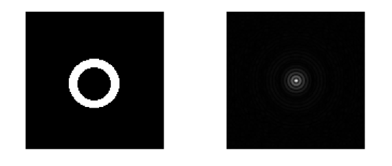
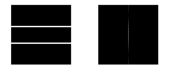
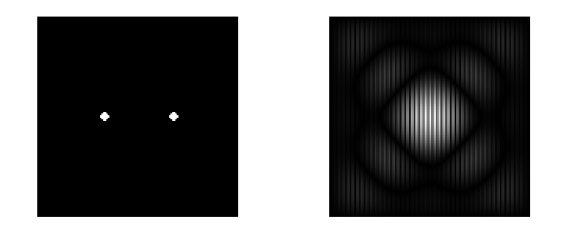
Figure 1. (a) Square Pattern and (b) its FFT

Figure 2. (a) Square Annulus Pattern and (b) its FFT

Figure 3. (a) Annulus Pattern and (b) its FFT

Figure 4. (a) 2 Slits Pattern and (b) its FFT

Figure 5. (a) 2 Dots Pattern and (b) its FFT

So far, these patterns are the most common ones and it will be helpful in the future to familiarize with their FTs.

B.  Anamorphic Property of the Fourier Transform

Sinusoids with Varying Frequency

A 2D sinusoid was created in Scilab and its FT was taken for varying frequency.  I used the frequencies;1, 3, 5, 10, and 15.  The following codes are used;

//Anamorphic property of the Fourier Transform
nx = 100; ny = 100;
x = linspace(-1,1,nx);
y = linspace(-1,1,ny);
[X,Y] = ndgrid(x,y);
f = 15;//vary frequency
z = sin(2*%pi*f*X);
scf(1);
subplot(121);
imshow(z,[]);
//imwrite(z/max(z), ‘Sinusoid_15.png’)
FFT = abs(fftshift(fft2(z)));
subplot(122);
imshow(FFT, []);
//imwrite(FFT/max(FFT), ‘Sinusoid FFT_15.png’);

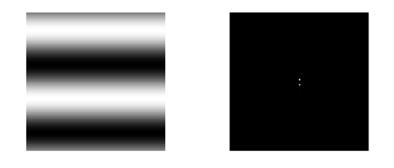
Figure 6. (a) Sinusoid with Frequency = 1 and (b) its FFT

Figure 7. (a) Sinusoid with Frequency = 3 and (b) its FFT

Figure 8. (a) Sinusoid with Frequency = 5 and (b) its FFT

Figure 9. (a) Sinusoid with Frequency = 10 and (b) its FFT

Figure 10. (a) Sinusoid with Frequency = 15 and (b) its FFT

To easily visualize the effect of varying the frequency in both the sinusoid and the FTs, I’ve created an animation of the above images using GIMP.  Please click on the image below to play…

Animated GIF; Sinusoids of Varying Frequency and their corresponding FT

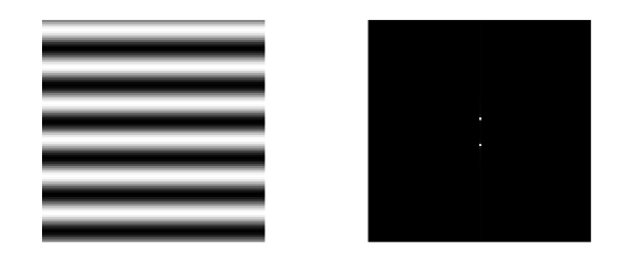
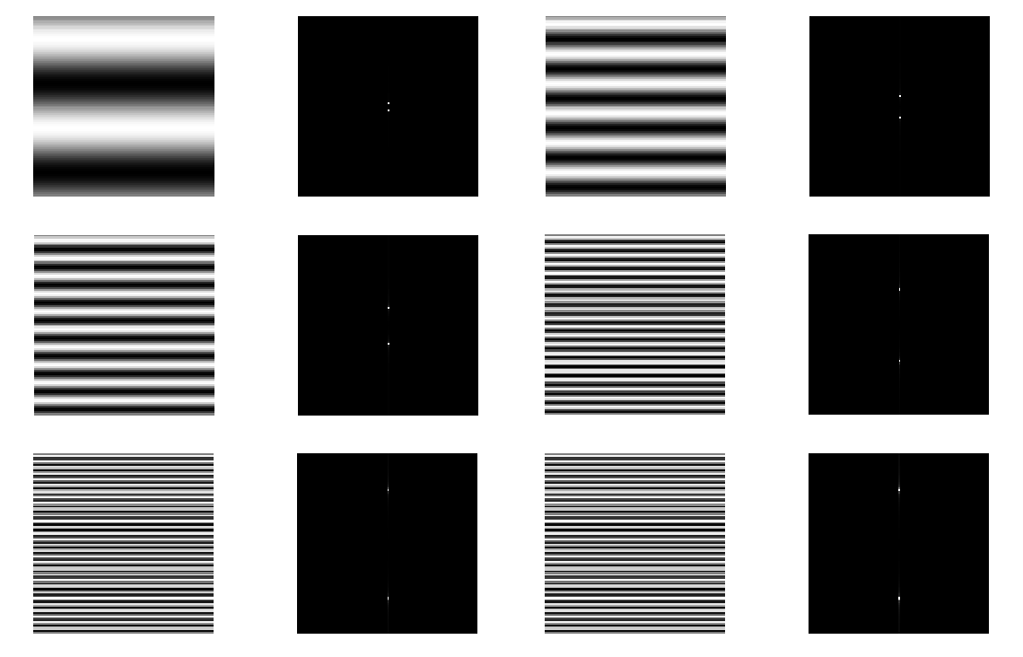
As we can see the increase in the frequency results to the increase in the spacing between the lines (or the dots which later on turned into lines with increased frequency) and also in the length of these lines.  One property of Fourier Transform is that complex FTs can be represented as combinations of simple FTs.  This can be seen in this particular FT of the sinusoid where it somehow resembles the FT of the 2 slits shown above.  This can be attributed to the fact that these sinusoids can be treated as combinations of 2 equally spaced slits.  The direction of the reproduced FT in relation to the direction of the original signal is also interesting to note, since as we can see they are perpendicular to each other.  Therefore, since our sinusoids are oriented horizontally, the FT will be oriented vertically and vice versa.
The lines in the FT are also symmetric to each other and this follows a general observation in FTs that they tend to be symmetric with the center (as observed from the previous FTs generated).  Also, the distance between them can be treated to be in agreement with the frequency inputted, i.e. increasing.  However, we can also observe that the increase in the frequency only result to the change in the position of the lines/spots/dots but their amplitudes, somehow, remain the same (denoted by the brightness).

Addition of Constant Bias

The next step is simulating a real image by adding a constant bias to the sinusoidal signal.  This was done via direct addition of the constant bias to the formula for the sinusoid.  The FT of the resulting signal will be also taken.  In Scilab code;

//Addition of Constant Bias

c = 1;

zbias = c + sin(2*%pi*f*X);

scf(3);

imwrite(zbias/max(zbias),’sinusoid with bias.png’);

imshow(zbias, []);

sinebias = abs(fftshift(fft2(zbias)));

scf(4);

imshow(sinebias, []);

mesh(sinebias);

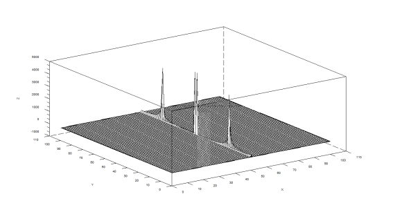
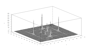
If we are to imagine these lines(dots) in the FTs of the sinusoids plotted in a 3D manner they would look like dirac deltas. Here I used the Scilab function mesh() to arrive to a 3D meshplots which can be a great help in visualizing the effect of adding bias.  In this 3D plot, these dirac-deltas are clearly shown.  The frequency used here is 15.

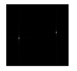
Figure 11. FT of sinusoid with added constant bias

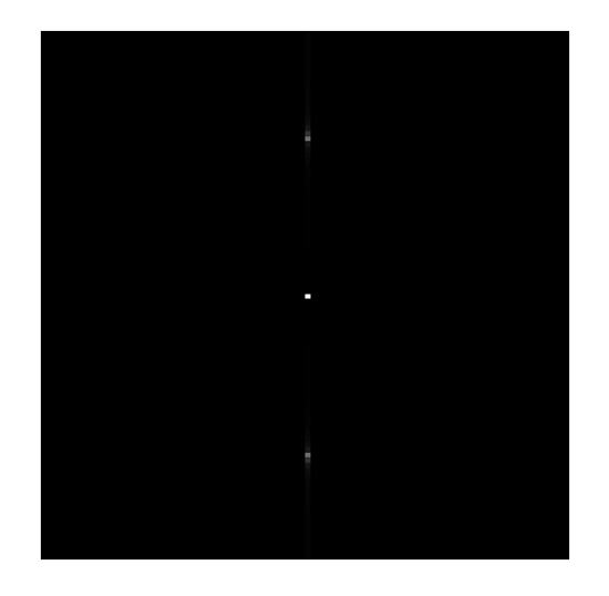
The manifestation of the addition of constant bias can be easily seen in the above figure courtesy of the the bright center dot.  Now, what difference does this brighter spot makes compared to the other spots?  This can be answered/visualized/observed if we resort to also taking their 3D meshplots.  And for this particular FT, its meshplot is shown below.

Figure 12. 3D Meshplot of the FT of a sinusoid with constant bias

Here, we can easily see that the brighter spot consequently translates to a dirac delta with a higher amplitude (although, in the amplitudes for both original sinusoid and the bias added are both 1).  We can also observe the structure of the dirac delta as it goes further away from the center.  Since we used 15 as our input frequency, the spots became more line-resembling denoted by the side accompaniments in our dirac deltas.

Now, lets revert back to the basic concepts invoked from the addition of the constant bias.  By the addition of a constant bias, we simply mean addition of a signal with a frequency of 0 Hz and no matter how big that constant is it will still translate to 0 Hz.  And in the Fourier domain they’re existing in the dimensions of frequency and that constant simply do have amplitude but its frequency is zero.

Suppose this 0 Hz frequency become persistent in actual experiments (let’s say performing Young’s double slit experiment), and one is looking for the actual frequencies from the generated interferograms, he can resolve this dilemma through numerical filtering of the central frequency or the 0 Hz frequency. This is done by creating a mask with zero on the center portion allowing the blockage of the occurrence of the constant bias appearing as a dirac delta on that portion. This, of course, is backed by our previous explanation that a constant bias translates to 0 Hz .  Now suppose that the bias added is not constant, let’s say some sinusoids of very low frequency and (say 0.5) we are given the  frequency of the  original signal (say 15).

Figure 13. Sinusoid with another sinusoid of low frequency bias

Figure 14. FFT of sinusoid with low frequency sinusoid bias

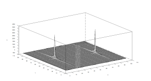
Figure 15. Meshplot of the FFT

The low frequency signal bias can be easily seen in the FFT.  Suppose that the frequency of an interferogram biased with this low frequency signal is unknown, we can get the frequency of it by creating a mask with zeros at the frequency corresponding to the frequency of the bias.

Rotation of Sinusoids

“In general, the rotation of the image results in equivalent rotation of its FT” [1].  This property will be explored in this section with varying angles of rotation (30 and 60).  This first are the Scilab codes used

// Rotate Sinusoids
theta = 60;
z = sin(2*%pi*f*(Y*sin(theta) + X*cos(theta)));
scf(5);
imshow(z, []);
imwrite(z/max(z), ‘Sinusoid Rotated at 60.png’);
rot = abs(fftshift(fft2(z)));
scf(6);
imshow(rot, []);
mesh(rot);
This is the plot of the sinusoid rotated at 30.

Figure 16. Sinusoid rotated at 30

And this is the corresponding FT

Figure 17. FT of the sinusoid rotated at 30

Again I used 3D mehsplots to show the effect of the rotation on the dirac-deltas

Figure 18. Meshplot of the FT of a sinusoid rotated at 30

If we increase the rotation to 60…

Figure 19. Sinusoid rotated at 60

Figure 20. FT of sinusoid rotated at 60

Figure 21. Meshplot of the FT of a sinusoid rotated at 60

Although, both are rotated with same angle of rotation, the direction of the rotation are different for the two domains. True to both rotation angles used, the rotation are perpendicular to each other and with opposing directions of rotation.  In my generated figures, the rotation can only be seen clearly in the FT.

Combination of Sinusoids

Now lets investigate what happens if we combine sinusoids in X and Y.  Basically, the combination means the product of two sinusoids oriented at different directions.  In Scilab, the codes will just be modifications of the codes used above.
// Combination of Sinusoids
z = sin(2*%pi*4*X).*sin(2*%pi*4*Y);
scf(7);
imshow(z, []);
imwrite(z/max(z), “Combination of sinusoids in X and Y.png’);
times = abs(fftshift(fft2(z)));
scf(8);
imshow(times, []);
mesh(times);
The combination of sinusoids…

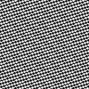
Figure 22. Combination of sinusoids in X and Y

The above chessboard-looking figure is basically the product of sinusoidal signal in perpendicular orientation.

The FT…

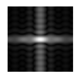
Figure 23. FT of the combination of sinusoids

And it’s meshplot…

Figure 24. Meshplot of the FT of the combination of sinusoids

Each sinusoid contributed 2 dirac deltas making  their resulting product to have FT of 4 dirac deltas.  From here we can say that the FT of  products of the input signals are just the superimposition of the FT of the individual signal.  This statement will be further elaborated in the next section where the two new learned ways of manipulating FTs will be both employed.

Combination with Rotation

Now let’s invoke both combination and rotation concepts in one.
This is done by adding several rotated sinusoids to the pattern generated through combination.  Here I used 4 rotations (at 30, 45, 60, and 90).
The Scilab code used;
// Combination of Sinusoids with Rotated Sinusoids
theta2 = 90;
timeswithrot = sin(2*%pi*4*X).*sin(2*%pi*4*Y) + sin(2*%pi*f*(Y*sin(theta) + X*cos(theta))) + sin(2*%pi*f*(Y*sin(theta2) + X*cos(theta2)));
scf(9);
imshow(timeswithrot, []);
//imwrite(timeswithrot/max(timeswithrot), ‘Combination of Sinusoids with Rotation at 60.png’)
timeswithrot = abs(fftshift(fft2(timeswithrot)));
scf(10);
imshow(timeswithrot, []);
mesh(timeswithrot);
Figure 25. Combination of Sinusoids with rotations (a) 30, (b) 45, (c) 60, and (d) 90
Their corresponding FTs
Figure 26. FTs of  the combination of sinusoids with rotated sinusoids at (a) 30, (b) 45, (c) 60, and (d) 90
Lastly, the 3D meshplots are shown…
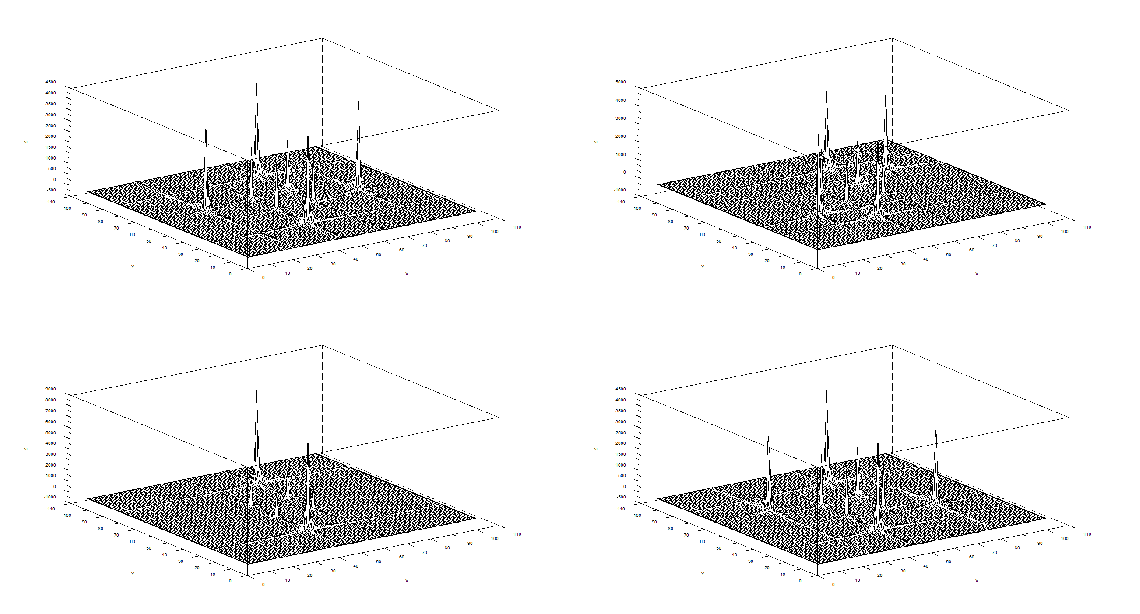
Figure 27. Meshplots of the FTs for the combination with rotation  (a) 30, (b) 45, (c) 60, and (d) 90

I’ve also made this GIMP animated GIF to visualize the effect of the variation in the rotation angle on the meshplots of the FTs.  Again, Please click on the image below to play…

Animated GIF; Meshplots of the FTs of the combination of sinusoids with varying rotation angles

Again, what we seen in the FTs are superimposition of the FTs of the  individual signals.

To wrap up, let us now give very brief answers to our introductory question.  So, basically, 2D FT are just extensions of the 1D FT.  Interestingly, complex FTs can be said to be just combinations of some simple FTs as shown in the sections on combinations.  Also, rotation is unique to 2D FT (compared to 1D FT). Bright spots in the FT can be visualized as dirac deltas with amplitude related to brightness.

I rate myself 10 for this activity for doing all the required things to do. 🙂

References:

1.  2D FFT. <http://www.cs.unm.edu/~brayer/vision/fourier.html>

2.  M. Soriano. Properties of the Fourier 2D Transform. Applied Physics 186. 2010.

Fourier Transform Model of Image Formation

Discrete Fourier Transform (DFT) is a form of Fourier analysis implemented to convert one function, say in the spatial or temporal domain, into another (frequency domain).  It serves as an important tool in digital signal and image processing to analyze frequencies in the sample signal or to perform other operations such as convolution.  An efficient implementation of DFT utilized in image processing is the Fast Fourier Transform (FFT).  It is applied to convert an image from the image (spatial) domain to its corresponding frequency domain. It is done because some operations are easier to execute in the frequency domain [1].

This activity is an introduction to the power of FFT in image processing.  Four activities will be done for familiarization and appreciation of its basic functions in image processing.

A.  Familiarization with discrete FFT

Basic Scilab commands used involved in FFT analysis will be explored in this section.  The Scilab function for FFT in 1D is fft1() while for 2D it is fft2().  Another important function is the fftshift(), which rearranges the fft output by moving the zero frequency to the center of the spectrum.  In showing images, it is important to make sure that values are real.  However, FFT operation yields complex number arrays, thus, to make use of imshow(), the function abs() which outputs the absolute value/magnitude must be invoked first.

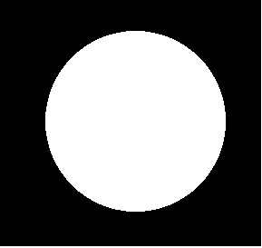
To demonstrate, an image of a white circle is drawn in black background (128 x 128) using Paint.  This image is exported in Scilab as a grayscale image (Figure 1 a).  The FFT of the 2D image was taken, furtheremore, abs() was applied to it (Figure 1 b).  It can be observe from this plot that the center of the image was disintegrated due to the reversal of the quadrants when the FFT was implemented.  This can be resolved by using the fftshift() function (Figure 1 c).  This FT is consistent with the analytical FT of the circle, it’s quadrants were just reversed.  Doing the inverse FFT will return the same image (Figure 1 d) as the original one but this doesn’t necessarily mean that it exactly returns the image since the image we are using is perfectly symmetrical.

Figure 1 (a) Original image of a white circle in black background (b) FFT of the original image (c) FFT with fftshift applied and (d) the inverse FFT

Now let’s look at the FFT of  larger circles.

Figure 2 (a) Original image of a white circle in black background (b) FFT of the original image (c) FFT with fftshift applied and (d) the inverse FFT

It can be observed from the above figure the manifestation on the FFT if a larger circle is used.

Now let us test the FFT of  an image of irregular shape, the image used is an image of the letter “A”.

Figure 3. Letter

Now, it can be seen that applying inverse fft doesn’t really return the image exactly, the image will actually be inverted.

The Scilab codes;

chdir(‘C:\Users\Rob H. Entac\Documents\Acads\1st Semester 10-11\App Phy 186\Act 6’);
// Familiarization of DFFT;circle and A
I = imread(‘circle.bmp’);
Igray = im2gray(I);
scf(0);
subplot(141);
imshow(Igray)
FIgray = fft2(Igray);
circlefft = abs(FIgray);
subplot(142);
imshow(circlefft, []);
circlefftshift = fftshift(abs(FIgray));
subplot(143);
imshow(circlefftshift, []);
circleifft = abs(fft2(fft2(Igray)));
subplot(144);
imshow(circleifft, []);

B.  Simulation of an Imaging Device

FFT can also be used in simulating imaging devices.  In this section,  circular lenses of varying radii will be used to image the word “VIP”.  This is done by creating separate images of circles and the word “VIP” in Paint, both having dimensions of 128 x 128.  In Scilab, the FFTs of the circle and “VIP” are multiplied and the inverse FFT is applied to the resulting product.  This method is called convolution or the smearing of a function against another one to obtain a resulting function that looks like both the two original functions [2].   Discussions on FFT will most likely progress to discussing convolution.In equation form it is given by

h ( x , y )=∫∫ f ( x ‘ , y ‘ ) g ( x – x ‘ , y – y ‘) dx ‘ dy’

Posted below are the results of convolving circles of varying radii with the image of “VIP”

Figure 4. Effects of Variation in the Dimension of an Imaging Device (a) Circles of varying radii as simulation of circular imaging devices (b) VIP;the object to be images and (c) The resultant image

Comparing the above images for different radii of circular aperture, we can see that the clarity and sharpness of the resulting image is dependent on the radius of the imaging device.  As the radius increases, the resemblance of the resulting image to the imaged one also increases.  This can be explained by the fact that the amount of light utilized in imaging is controlled by the size of the aperture.  On the first figure, when the circular aperture is small, the image of VIP is very blurred and the background is whitish.  When the aperture was increased, the image became more readable and the background turned grayer.  Furtheremore, when the aperture was again increased, the edges became more refined, also the background became darker.  However, the  imaging device of “finite” radius won’t result to an image of complete resemblance with the original image.  Light entry will always be limited by the size of the imaging device.

The Scilab codes used are

//Simulation of an imaging device

scf(1);

vip = imread(‘VIP.bmp’);

c = imread(‘circle.bmp’);

cgray = im2gray(c);

subplot(131);

imshow(cgray);

vipgray = im2gray(vip);

subplot(132);

imshow(vipgray);

Fr = fftshift(cgray);

Fvip = fft2(1 – vipgray);

FRA = Fr.*(Fvip);

IRA = fft2(FRA);

FImage = abs(IRA);

subplot(133);

imshow(FImage, []);

C.  Template Matching using Correlation

Aside from convolution, another important extensive application of FFT is correlation.  Correlation measures the degree of similarity between two functions and is based on how identical the functions are (i.e., the more identical, the higher the correlation) [2].  Mathematically this is given by

p ( x , y )=∫∫ f ( x ‘ , y ‘ ) g ( x+x ‘ , y+y ‘ ) dx’ dy ‘

In image processing, this method is used in template matching, a pattern recognition technique that utilizes  the core principle of correlation.  In this section correlation will be done between the image of the phrase “THE RAIN IN SPAIN STAYS MAINLY ON THE PLANE” and of the letter “A” of the same font as the phrase.  This is done by again getting the FT of both images.  Here, we  will be using a new Scilab function, conj().  This  is used to get the complex conjugate of a given function and is applied to the phrase in focus.  The conjugate of the FT of the phrase will then be multiplied element by element with the FT of the letter “A”.

Here’s how it was done in Scilab

//Template Matching using Correlation

spain = imread(‘spain2.bmp’);

a2 = imread(‘a2.bmp’);

scf(2);

subplot(131);

spaingray = im2gray(spain);

imshow(spaingray);

a2gray = im2gray(a2);

subplot(132);

imshow(a2gray);

spainf = fft2(spaingray);

a2f = fft2(a2gray);

correlate = abs(fftshift(fft2(a2f.*(conj(spainf)))));

subplot(133);

imshow(correlate, []);

Figure 6.  Correlation between the given phrase and the letter

It can be seen from the correlation that the As in the phrase look like bright/dark spots (depending on the background) resembling the FFT of A.  This is an evidence that indeed the two images are correlated.  However, in correlating, it is important that their fonts are of the same size.  Correlation is actually somewhat related to convolution.

If, we, on the other hand use the letter “T” instead of “A”, the correlation would become

Figure 7. Correlation with letter T

As we can see, Ts in the phrase also appear as highlighted and again resembled the shifted FFT of the letter T shown below

Figure 8. Center shifted FFT of the letter T

D.  Edge Detection Using the Convolution Integral

Lastly, edge detection using variable pattern will be investigated for the word VIP.  Here, another new Scilab function will be introduced; imcorrcoef().  Basically what this function does is template matching by normalized correlation.  The patterns used are horizontal, vertical, and diagonal.  Patterns to be used are 3 x 3 matrices, the total sum of each must be zero.

The horizontal pattern is given by

For the vertical;

And for the diagonal;

These patterns are convolved with VIP image using the imcorrcoef() function introduced above.

The results of the edge detection are shown below

Figure 9. (a) Original image and with edge detection using (b) horizontal (c) vertical and (d) diagonal patterns

It can be seen from the figures that the edge detection was successfully implemented in this section. Orientation of the detected edges follow the given pattern.  Using the horizontal pattern, the edges in the image which are oriented horizontally are the most visible, followed by those diagonal and non-linear edges. The vertical edges here are not seen.  On the other hand, when the vertical pattern was used, the horizontal edges are now the”invisible”.  Edges of other orientation are also visible.  In the case of the diagonal pattern, it seems that all edges are correlated.  This can be attributed to the fact that the diagonal pattern has both horizontal and vertical components.

The codes used;

// Edge Detection using the Convolution Integral

hor = [-1 -1 -1; 2 2 2; -1 -1 -1];

ver = [-1 2 -1; -1 2 -1; -1 2 -1];

dia = [-1 -1 -1; -1 8 -1; -1 -1 -1];

scf(3);

subplot (141);

imshow(vipgray);

vip_edgehor = imcorrcoef(1 – vipgray, hor);

subplot(142);

imshow(vip_edgehor/max(vip_edgehor));

vip_edgever = imcorrcoef(1 – vipgray, ver);

subplot(143);

imshow(vip_edgever/max(vip_edgever));

vip_edgedia = imcorrcoef(1 – vipgray, dia);

subplot(144);

imshow(vip_edgedia/max(vip_edgedia));

For this activity, I gave myself a grade of 10, for performing all the required tasks for this activity. 🙂

References:

1.     Implementation of Fast Fourier Transform for Image Processing in DirectX 10.    Intel Software Network. 7 Sept. 2009 Web. 27 July 2010.

2.     M. Soriano.  Fourier Transform Model of Image Formation.  Activity 6 Manual. Applied Physics 186. 2010

Enhancement by Histogram Manipulation

Images of low contrast both suffer from their lack of aesthetic value and from supposed concealment of some necessary informations.  They can be attributed to many factors such as poor focusing, presence of smoke, low lighting levels during imaging, lens flare [1], etc. Although sometimes they are unavoidable, image enhancement can be done to enhance the contrast and furtheremore retrieve the supposed data loss. Enhancement is a necessity particularly to images used in the  practical sciences like in medicine and in astronomy. Conventional image processing programs such as Adobe Photoshop© and its freeware substitute, GIMP offer a lot of options to enhance a low contrast image.  One less explored way of image enhancement is through histogram manipulation and our heroic freeware Scilab can once again make a way to perform this operation.

The graylevel Probability Distribution Function (PDF) is equal to the normalized histogram of a grayscale image.  In this activity, image enhancement will be performed by modifying a grayscale PDF through backprojection of a desired Cumulative Distribution Function (CDF) to it [2].  We chose to manipulate the PDF through the CDF because it is easier to produce a smooth plot that will have just a slight difference with the original CDF compared to directly manipulating the spectrum-like plot of a PDF. Ideally, CDF’s are not smooth and undefinable using simple functions.  Here, four ideal CDFs will be backprojected; a linear and 3 non linear functions to simulate the response of the human eye which is known to be nonlinear.  These will include a quarter circle, a parabolic and a sigmoid function defined using a hyperbolic tangent function.  The PDF of the enhanced images will be compared with those of the original image.  The CDF will be also taken to show that the new images really follow the behavior of the backprojected CDFs.  In performing the backprojection, the interp1 command in Scilab was used.  Shown below is an image showing the step in altering the grayscale distribution [2].
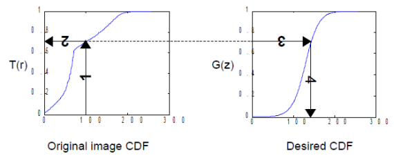
Figure 1. Steps in altering the grayscale distribution.( 1) From pixel grayscale, find CDF value (2). Trace this value in the desired CDF (3). Replace pixel value by grayscale value having this CDF value in desired CDF (4).

For the linear CDF, the equation used is the equation of a line with slope 1/255. For all plots displayed the x range is 0 to 255, and y range is 0 to 1. For the quarter circle, the equation used is just the equation of a circle centered at (255, 0).  A simple parabola of order 2 was plotted for the quadratic and a hyperbolic tangent function {tanh(16.*((a-127.5)./255))} was used to plot a desired CDF similar to the one shown in the figure below.
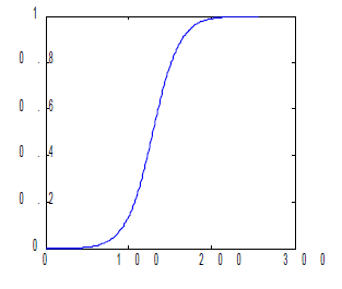
Figure 2. Desired CDF

Shown below are examples of the image enhancement done using these steps, the original image will be displayed together with the enhanced images using the desired CDFs, the 4 CDFs to be backprojected will be also shown, and finally the PDFs and CDFs of the original and the enhanced images will be displayed.  To evaluate the capability of the program in image enhancement I will be applying it on 4 images.  From these side by side plots, the manifestation of the manipulation can be easily visualized.  (I used subplot for multiple plotting, although it made my code painfully long it looks more conclusive that way ).

The first image is a personal pic from our hiking last summer in Batangas.
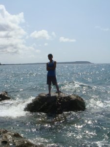
Figure 3. Image to be enhanced

The plot of the ideal CDFs  to be backprojected to the original PDF is shown below
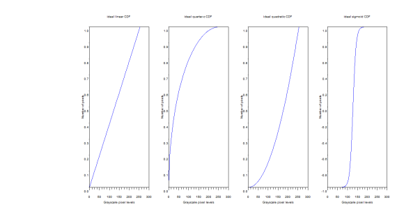
Figure 4. Ideal CDFs to be bacjprojected to the PDF of the original image

(a) (b) (c) (d) (e) Figure 5. Image Enhancement; (a) Original Image, (b) Enhanced image with Linear CDF, (c) with quarter circle CDF, (d) parabolic CDF, and (e) sigmoid CDF

From these figures we can easily see the effect of backprojecting different CDFs to a grayscale image.  However, the choice on the best CDF to use still depends on the application of the image enhancement.

The corresponding PDFs are shown.
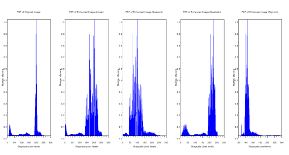
Figure 6. PDFs of the original and enhanced images

The manifestation of the ideal CDF backprojection can be easily seen from the PDFs.  The graylevel distributions changed.  The original image has grayscale maximum of 255 and a minimum of 0.228.  The linear CDF-enhanced image now has a grayscale max of 255 and a min of 0.000659.  For the quarter circle the max is 255 and the min is 0.0000291.  The quadratic has a max of 255 and a min of 0.1672454.  Finally the sigmoid function has a max of 253.603 and a min of 127.59751.

And the corresponding CDFs…
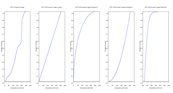
Figure 7. CDFs of the original and enhanced images

From the above figure, it can be inferred that the CDF of the enhanced images really do follow the backprojected ideal CDFs.

I also tried enhancing several images using these codes.  Shown below in succession are the figures of the original and the enhanced image, the PDFs and the CDFs.

The image is of  a flower

Figure 8. Original and Enhanced Images
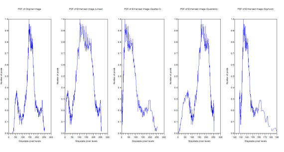
Figure 9. PDFs of the original and the enhanced image

The original image has grayscale maximum of 255 and a minimum of 24.  The linear CDF-enhanced image now has a grayscale max of 255 and a min of 0.0153245.  For the quarter circle the max is 255 and the min is 0.0006729.  The quadratic has a max of 255 and a min of 1.9692508.  Finally the sigmoid function has a max of 189.45846 and a min of 127.50096.
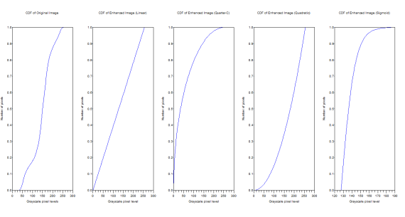
Figure 10. CDFs of the original and the enhanced images

I also tried enhancing another photo taken from our Batangas hiking, this time it is an image of the shore.

Figure 11. Original and Enhanced Images

Figure 12. PDFs of the original and the enhanced images
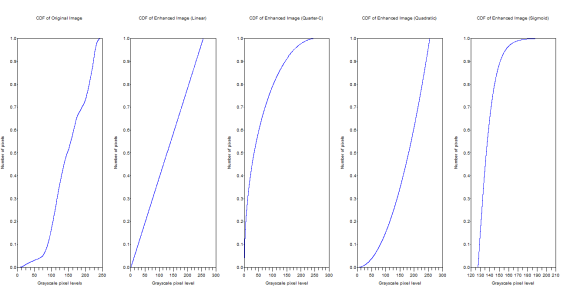
Figure 13. CDFs of the original and the enhanced images

Lastly, I tried the histogram manipulation on the image of the the standard image processing subject, the famous Lena Sjobloom.

Below is her image taken from http://ndevilla.free.fr/lena/

Figure 14. Image of Lena Sjobloom, popular image processing test subject

The grayscale image and the enhanced images are shown below

Figure 15. Original and Enhanced Images
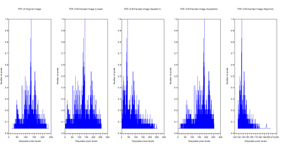
Figure 16. PDFs of the Original and the Enhanced Images
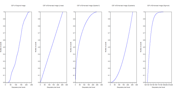
Figure 17. CDFs of the original and enhanced images

I think I have already presented enough examples of the enhancements done using histogram manipulation done on Scilab.

Now let us revert back to conventional image processing.  The freeware GIMP has a command curve where the histogram can be manipulated. Shown below is an image of how it is done in GIMP.

Figure 18. Histogram Manipulation in GIMP

Shown below are examples of the enhancements done using different curves.
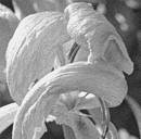
Figure 19. Enhanced image using Linear Color Curve
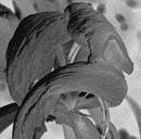
Figure 20. Enhanced image using linear (negative slope) color curve
Figure 21. Enhanced Image using quadratic color curve

I give myself a grade of 10 for this activity, being able to do all the necessary things.

Appendix

CODES USED:

chdir(‘C:\Users\Rob H. Entac\Documents\Acads\1st Semester 10-11\App Phy 186\Act 5’);
stacksize(100000000);
I = imread(‘london.jpg’);
GIm = im2gray(I);
scf(0);
subplot(151);
imshow(GIm);
//PDF
GI = GIm*255;
pdf = tabul(GI,’i’);
GI_max = max(GI)
GI_min = min(GI)
//CDF
cdf = cumsum(pdf(:,2));
cdf = cdf/max(cdf);
//CDF ideal linear
a = [0:1:255];
b = [0:1/255:1];
//Backprojection Linear CDF
i = interp1(pdf(:,1),cdf,GI);
j = interp1(b,a,i);
j_max = max(j)
j_min = min(j)
subplot(152);
imshow(j,[0,255]);
//PDF of Enhanced Image (Linear)
Elpdf = tabul(j,’i’);
//CDF of Enhanced Image (Linear)
Elcdf = cumsum(Elpdf(:,2));
Elcdf = Elcdf/max(Elcdf);
//CDF ideal quarter-c
c = sqrt((255)^2 – (a-255)^2);
c = c/max(c);
//Backprojection quarter-c CDF
k = interp1(pdf(:,1),cdf,GI);
l = interp1(c,a,k);
l_max = max(l)
l_min = min(l)
subplot(153);
imshow(l,[0,255]);
//PDF of Enhanced Image (Quarter-C)
Eepdf = tabul(l,’i’);
//CDF of Enhanced Image (Quarter-C)
Eecdf = cumsum(Eepdf(:,2));
Eecdf = Eecdf/max(Eecdf);
//CDF ideal quadratic
d = a^2;
d = d/max(d);
//Backprojection Quadratic
m = interp1(pdf(:,1),cdf,GI);
n = interp1(d,a,m);
n_max = max(n)
n_min = min(n)
subplot(154);
imshow(n,[0,255]);
//PDF of Enhanced Image (Quadratic)
Eqpdf = tabul(n,’i’);
//CDF of Enhanced Image (Quadratic)
Eqcdf = cumsum(Eqpdf(:,2));
Eqcdf = Eqcdf/max(Eqcdf);
//CDF ideal sigmoid
e = tanh(16.*((a-127.5)./255));
//Backprojection Sigmoid
o = interp1(pdf(:,1),cdf,GI);
p = interp1(e,a,o);
p_max = max(p)
p_min = min(p)
subplot(155);
imshow(p,[0,255]);
//PDF of Enhanced Image (Sigmoid)
Espdf = tabul(p,’i’);
//CDF of Enhanced Image (Sigmoid)
Escdf = cumsum(Espdf(:,2));
Escdf = Escdf/max(Escdf);
//PLOTTINGcodes
//PDF original
scf(1);
subplot(151);
plot(pdf(:,1),pdf(:,2)/max(pdf(:,2)));
title(‘PDF of Original Image’);
xlabel(‘Grayscale pixel levels’);
ylabel(‘Number of pixels’);
//PDF linear enhanced
subplot(152);
plot(Elpdf(:,1),Elpdf(:,2)/max(Elpdf(:,2)));
title(‘PDF of Enhanced Image (Linear)’);
xlabel(‘Grayscale pixel levels’);
ylabel(‘Number of pixels’);
//PDF quarter-c enhanced
subplot(153);
plot(Eepdf(:,1),Eepdf(:,2)/max(Eepdf(:,2)));
title(‘PDF of Enhanced Image (Quarter-C)’);
xlabel(‘Grayscale pixel levels’);
ylabel(‘Number of pixels’);
//PDF quadratic enhanced
subplot(154);
plot(Eqpdf(:,1),Eqpdf(:,2)/max(Eqpdf(:,2)));
title(‘PDF of Enhanced Image (Quadratic)’);
xlabel(‘Grayscale pixel levels’);
ylabel(‘Number of pixels’);
//PDF sigmoid enhanced
subplot(155);
plot(Espdf(:,1),Espdf(:,2)/max(Espdf(:,2)));
title(‘PDF of Enhanced Image (Sigmoid)’);
xlabel(‘Grayscale pixel levels’);
ylabel(‘Number of pixels’);
//CDF original
scf(2);
subplot(151);
plot(pdf(:,1),cdf);
title(‘CDF of Original Image’);
xlabel(‘Grayscale pixel levels’);
ylabel(‘Number of pixels’);
//CDF linear
subplot(152);
plot(Elpdf(:,1),Elcdf);
title(‘CDF of Enhanced Image (Linear)’);
xlabel(‘Grayscale pixel level’);
ylabel(‘Number of pixels’);
//CDF quarter-c
subplot(153);
plot(Eepdf(:,1),Eecdf);
title(‘CDF of Enhanced Image (Quarter-C)’);
xlabel(‘Grayscale pixel level’);
ylabel(‘Number of pixels’);
//CDF quadratic
subplot(154);
plot(Eqpdf(:,1),Eqcdf);
title(‘CDF of Enhanced Image (Quadratic)’);
xlabel(‘Grayscale pixel level’);
ylabel(‘Number of pixels’);
//CDF sigmoid
subplot(155);
plot(Espdf(:,1),Escdf);
title(‘CDF of Enhanced Image (Sigmoid)’);
xlabel(‘Grayscale pixel level’);
ylabel(‘Number of pixels’);
//ideal linear CDF
scf(3);
subplot(152);
plot(a,b);
title(‘ideal linear CDF’);
xlabel(‘Grayscale pixel levels’);
ylabel(‘Number of pixels’);
//ideal quarter-c CDF
subplot(153);
plot(a,c);
title(‘ideal quarter-c CDF’);
xlabel(‘Grayscale pixel levels’);
ylabel(‘Number of pixels’);
//ideal quadratic CDF
subplot(154);
plot(a,d);
title(‘ideal quadratic CDF’);
xlabel(‘Grayscale pixel levels’);
ylabel(‘Number of pixels’);
//ideal sigmoid CDF
subplot(155);
plot(a,e);
title(‘ideal sigmoid CDF’);
xlabel(‘Grayscale pixel levels’);
ylabel(‘Number of pixels’);

References:

1.  Low Contrast Images. <http://en.mimi.hu/photography/low_contrast.html>

2.  M. Soriano. Enhancement by Histogram Manipulation. Applied Physics 186 Activity 5 Manual. 2010.
Area Estimations for Images with Defined Edges

Area approximation from images is one very practical application of image processing. Probably one of its most basic applications is in remote land area approximation. Green’s Theorem and Morphological operations are the basic techniques involved in the appriximation. Using Scilab, SIP toolbox, and Paint, the area is estimated for regular, geometric shapes, as well as for some real samples taken from Googlemaps. The estimation was then verified by computing the theoretical area using the formulas for regular shapes, and areas for remote land area approximation was taken from the Web.

The first part of the activity deals with the basics; area approximation for regular shapes (circle, rectangle, and triangle). These regular shapes were drawn using Paint and saved as Bitmap files. They are drawn such that the inner part is white and the background is black. This is to enable using the follow command in Scilab which is a contour follower for binary images. It was observed that it really doesn’t work for other image types. Using the Scilab code shown below the image approximations were done for the abovementioned shapes.

C = imread(‘Circle.bmp’);
R = imread(‘Rectangle.bmp’);
T = imread(‘Triangle.bmp’);

[x_C,y_C]=follow(C);
[x_R,y_R]=follow(R);
[x_T,y_T]=follow(T);

a = length(x_C);
b = length(x_R);
c = length(x_T);

A_C = [];
A_R = [];
A_T = [];

for i=1:a-1
A_C(i) = x_C(i)*y_C(i+1)-y_C(i)*x_C(i+1);
end

for j=1:b-1
A_R(j) = x_R(j)*y_R(j+1)-y_R(j)*x_R(j+1);
end

for k=1:c-1
A_T(k) = x_T(k)*y_T(k+1)-y_T(k)*x_T(k+1);
end

Theo_Circle = %pi*((max(x_C)-min(x_C))/2)^2
Theo_Rectangle = (max(x_R)-min(x_R))*(max(y_R)-min(y_R))
Theo_Triangle = (max(x_T)-min(x_T))*(max(y_T)-min(y_T))*(1/2)

Area_Circle = sum(A_C)/2
Area_Rectangle = sum(A_R)/2
Area_Triangle = sum(A_T)/2

Percent_Error_Circle = abs(((Theo_Circle-Area_Circle)/(Theo_Circle))*100)
Percent_Error_Rectangle = abs(((Theo_Rectangle-Area_Rectangle)/(Theo_Rectangle))*100)
Percent_Error_Triangle = abs(((Theo_Triangle-Area_Triangle)/(Theo_Triangle))*100)
The figures used are shown below with informations on their respective area approximation.

Figure 1. Circle

Theoretical = 30790.75
Computed Area = 30760.5
Percentage Error = 0.0982425
The theoretical values is computed using the formula for the area of a circle, the radius used is just half the max-min pixel location.

Figure 2. Rectangle

Theoretical = 57814
Computed Area = 57644
Percentage Error = 0.2940464
The theoretical area is computed using the formula for finding the area of a rectangle. The dimensions used are the difference in the max and min pixel location for both x and y coordinates.

Figure 3. Triangle


Theoretical = 36685
Computed Area = 36677
Percentage Error = 0.0218073
The theoretical area was computed using the formula for finding the triangle’s area which is . The base and the height were again taken from the difference of the max and the min pixel location.
It can be said that the estimation is effective from the small magnitudes of percentage errors. But this is only for the regular shaped image, how about area estimation on the real, complicated maps.
For more advanced applications, the same concept will be used for remote area approximation for the land areas of Colorado, USA, the Vatican City, and the Araneta Coliseum (this is in decreasing size). A print screen image was captured from the Googlemap and pasted on Paint. The borders for the specific area were defined by tracing with black lines/curves (this would introduce most of the errors that’s why a very tedious tracing must be employed). The ratio between the pixels and the physical measurement was computed using the given scale factor. Pixel locations were also obtained from Paint. The Region of Interest was then filled with white and the outer part with black. However, it should be noted that the obtained black and white image is not necessarily binary image, thus, conversion must be first made. Why make it binary? Since the Scilab command follow to be used is actually a counter follower for binary images.
The validity of the approximation will be confirmed using their known land area. I will first engage in estimating Colorado’s land area because of all terrritories it has the simplest shape, simply rectangular.
Figure 4. Map of Colorado

Figure 5. Binary Image Representation

Codes
Co = imread(‘Colorado.bmp’);
[x_Co,y_Co]=follow(Co);
d = length(x_Co);
A_Co = [];
for l=1:d-1
A_Co(l) = x_Co(l)*y_Co(l+1)-y_Co(l)*x_Co(l+1);
End
Theo_Colorado = 269837 //known value
Area_Colorado = sum(A_Co)/2
True_Area_Colorado = (Area_Colorado)*(3.36672) //km-pixel ratio
Percent_Error_Colorado = abs(((Theo_Colorado-True_Area_Colorado)/(Theo_Colorado))*100)
The result is given by
Theoretical = 269837
Computed Area = 36677
Computed Area multiplied with the ratio = 268578.4 (square kilometer)
Percentage Error = 0.4664280
From the Web, the area of Colorado is 269,837 square km. From my calculation the area in pixels is 36677. By using the scale factor from the ratio on Paint which is 109 pixels for every 200 km. The ratio in square km per pixel is 3.36672. This was multiplied to the computed area, and the result as shown has a percentage error of 0.4664280. It’s kinda effective, I think.
For more complex approximation, I will try estimating the area of the World’s smallest country, the Vatican City. So here’s it’s image from the Googlemap…

Figure 6. Map of the Vatican City

And here’s my binary image representation of it…

Figure 7. Binary Image Representation


I have to say that my representation is not that exact since the map is so complicated . I have a hard time edge detecting… However, I will still try. So here’s my code;
V = imread(‘Vatican.bmp’);
[x_V,y_V]=follow(V);
e = length(x_V);
A_V = [];
for m=1:e-1
A_V(m) = x_V(m)*y_V(m+1)-y_V(m)*x_V(m+1);
end
Theo_Vatican = 440000 //known value
Area_Vatican = sum(A_V)/2
True_Area_Vatican = (Area_Vatican)*(3.2464897) //m-pixel ratio
Percent_Error_Vatican = abs(((Theo_Vatican-True_Area_Vatican)/(Theo_Vatican))*100)

The result is…
Theoretical = 440000 (square meter)
Computed Area = 470294.61
Percent Error = 6.8851396
Let me first give brief explanation before I bombard my own estimation with criticisms. The method I used here is similar to the previous method used. Here my square meter-pixel ratio is 3.2464897 as computed from the scale factor and from the information obtained by pixel locating in Paint.
Well, as expected I have a huge error for this one relative to my Colorado Area estimation. This just proves that it is harder to measure the area of complicated maps. I also have to blame my carelessness in edge detecting and tracing. But I can still say that, although my error is relatively big, for me it is still reliable.
I will now try to estimate the area of a famous landmark. I chose the Araneta Coliseum, simply because I can find some necessary measurements of it from the Web.  Following the same procedure as I have done before, a printscreen from Googlemaps is obtained and a binary image representation was made using the power of Paint!

Figure 8. Map of the Araneta Coliseum


Figure 9. Binary Image Representation

Then it is now the Scilab’s job to do the computations. Here’s my code;
Ar= imread(‘Araneta.bmp’);
[x_Ar,y_Ar]=follow(Ar);
f = length(x_Ar);
A_Ar = [];
for n=1:f-1
A_Ar(n) = x_Ar(n)*y_Ar(n+1)-y_Ar(n)*x_Ar(n+1);
End
Theo_Araneta = %pi*(54)^2//108 is the dome diameter
Area_Araneta = sum(A_Ar)/2
True_Area_Araneta = (Area_Araneta)*(0.084016)//pixel-meter ratio
Percent_Error_Araneta = abs(((Theo_Araneta-True_Area_Araneta)/(Theo_Araneta))*100)

The result is given
Theoretical = 9160.8842
Computed Area = 9350.8548
Percentage Error = 2.0737147
Here my a priori knowledge of the Aranate Coliseum’s dimension is its diameter of 108 meters. So in my theoretical value I computed its area using that value. My pixel-meter ratio is 0.084016. 2% is indeed smaller than my previous attempt in estimating the area of the Vatican City. Of course it’s just because my image is much simpler.
As a conclusion, the method used is indeed reliable in area estimation. I am already happy with my maximum error of 6 %. My errors are definitely caused by the deformation of the original area when I made my binary image representations. (This can remedied by invoking much more OC-ness!). Another thing is on the pixel locating in computing for the pixel-to-physical quantity ratio. This is also prone to error given that the lines for the scale (scale bar?) are not just lines with single pixel.
There you go…I think I’ve done all the necessary things to do for this activity. I rate myself 10/10.
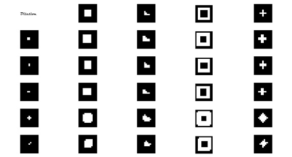
Image Types and Formats

The rapidly digitalizing world catapulted the exponential surge of photographs and images available to mankind.  These images come in different types and formats, i.e. no monopoly.  Basic image types include binary, grayscale, true color and indexed images.  Common image file formats are JPEG, TIF, PNG, and GIF.  In this activity, examples of the different image types listed would be given with specifications derived from GIMP and Scilab.  Also, the different image file formats will be discussed.  Lastly, image manipulation/conversion/transformation 🙂 will be done to some images.

Basic Image Types

Binary Image

Black OR white image. This type of image, however, crude-looking they are (as compared to the other flamboyant types), is used in many applications since, obviously, they are the easiest and the simplest to process.  However, its usage is limited by its impoverished representation of image information.  But if all the useful information can be provided by just the silhouette of the object, and that silhouette can be easily obtained, then it can be absolutely useful. Some common applications include; identifying objects on a conveyor (e.g. sorting chocolates), identifying object orientation, and on interpreting text [1].  Shown below is the Linux’ penguin in binary image type.

Figure 1. Binary Image

GIMP Image Properties

Pixel Dimension:         127 x 150 pixels

Print size:        44.80 x 52.92 millimeters

Resolution:      72 x 72 ppi

Color space:    RGB color

File Name:       C:\Users\R…binary.jpeg

File size:          3.8 KB

File Type:        JPEG Image

Size in memory:                      206.6 KB

Number of pixels:       19050

Source:            http://izaak.jellinek.com/tuxes/

Scilab Commands

–>imread(‘C:\Users\RnR-\Documents\Rob\Images\Binary image.jpg’);

Size:   150 rows X 127 columns

Truecolor Image

–>size(I)

ans  =

150.    127.    3.
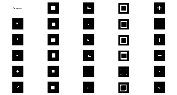
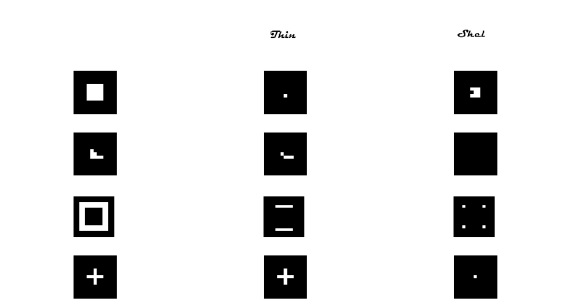
–>imfinfo(‘C:\Users\RnR-\Documents\Rob\Images\Binary image.jpg’,’verbose’);

FileName: C:\Users\RnR-\Documents\Rob\Images\Binary image.jpg

FileSize: 3891

Format: JPEG

Width: 127

Height: 150

Depth: 8

StorageType: truecolor

NumberOfColors: 0

ResolutionUnit: centimeter

XResolution: 72.000000

YResolution: 72.000000

Grayscale Image

Black and white image.  Images in this type are in shades of gray.  One major reason in using grayscale image is that less information is needed for each pixel.  In fact, ‘gray’ is pone in which red, green, and blue components all have equal intensity in RGB space, and so it is only necessary to specify single intensity value for each pixel.  Grayscale images are very common since much of today’s display and image capture hardware can only support 8-bit images.  Also, they entirely sufficient for many tasks and so there is no need to use more complicated and harder-to-process images [2].  Shown below is an image of peppers ion grayscale.

Figure 2. Grayscale Image

GIMP Image Properties

Pixel dimensions:        137 x 137 pixels

Print size:        36.25 x 36.25 millimeters

Resolution:      96 x 96 ppi

Color space:    Grayscale

File Name:       C:\Users\R…Grayscale.jpg

File size:          4.3 KB

File Type:        JPEG Image

Size in memory:                      145.2 KB

Number of pixels:       18769

Source: http://inperc.com/wiki/index.php?title=Grayscale_Images

Scilab Commands

–>imread(‘C:\Users\RnR-\Documents\Rob\Images\Grayscale.jpg’);

Size:   137 rows X 137 columns

Indexed Image

–>size(I)

ans  =

137.    137.    3.

–>imfinfo(‘C:\Users\RnR-\Documents\Rob\Images\Grayscale.jpg’,’verbose’);

FileName: C:\Users\RnR-\Documents\Rob\Images\Grayscale.jpg

FileSize: 4405

Format: JPEG

Width: 137

Height: 137

Depth: 8

StorageType: indexed

NumberOfColors: 256

ResolutionUnit: inch

XResolution: 96.000000

YResolution: 96.000000

Truecolor Image

Most of the colored images belong to this type; they are the images that appear to the human eye as “real” colors i.e. the combination of the additive primary colors of red, green and blue (RGB).  They are undoubtedly the most sophisticated image type since they contain more information as compared to other types, but would consume larger memory. Shown below is an image of what I consider the most amazing man-made structure in the world, the Petra in Jordan.

Figure 3. Truecolor Image

GIMP Image Poperties

Pixel dimensions:        110 x 133 pixels

Print size:        36.61 x 46.92 millimeters

Resolution:      72 x 72 ppi

Color Space:    RGB color

File Name:       C:\Users\R…truecolor.jpg

File Size:         3.5 KB

File Type:        JPEG image

Size in memory:                      189.3 KB

Number of pixels:       14630

Source:            http://www.adventure-travel.org.uk/ASIA/petra.php

Scilab Commands

–>imread(‘C:\Users\RnR-\Documents\Rob\Images\Truecolor.jpg’);

Size:   133 rows X 110 columns

Truecolor Image

–>size(I)

ans  =

133.    110.    3.
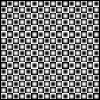
–>imfinfo(‘C:\Users\RnR-\Documents\Rob\Images\Truecolor.jpg’,’verbose’);

FileName: C:\Users\RnR-\Documents\Rob\Images\Truecolor.jpg

FileSize: 3563

Format: JPEG

Width: 110

Height: 133

Depth: 8

StorageType: truecolor

NumberOfColors: 0

ResolutionUnit: centimeter

Xresolution: 72.000000

Yresolution: 72.000000

Indexed Image

An indexed image is a practical way of representing color images.  Indexed images are made up of two parts, pixel data and color model data, which is also called as gradient or palette.  Each pixel gets its color equivalent from the color model for the color corresponding to the pixel’s index [3].  Shown below is an indexed image of a mandrill, which was originally a truecolor image, then converted to an indexed image using matlab.

Figure 4. Indexed Image

GIMP Image Poperties

Pixel dimensions:        344 x 327 pixels

Print size:        121.36 x 115.36 millimeters

Resolution:      72 x 72 ppi

Color space:    Indexed color (231 colors)

File Name:       C:\Users\R…Indexed.jpg

File Size:         86.5 KB

File Type:        GIF image

Size in memory:                      1014.3 KB

Number of pixels:       112488

Source:            http://www.mathworks.com/access/helpdesk/help/techdoc/ref/image.html

Scilab Commands

–>imread(‘C:\Users\RnR-\Documents\Rob\Images\Indexed.jpg’);

Size:   327 rows X 344 columns

Indexed Image

–>size(I)

ans  =

327.    344.    3.

–>imfinfo(‘C:\Users\RnR-\Documents\Rob\Images\Indexed.jpg’,’verbose’);

FileName: C:\Users\RnR-\Documents\Rob\Images\Indexed.jpg

FileSize: 88566

Format: GIF

Width: 344

Height: 327

Depth: 8

StorageType: indexed

NumberOfColors: 256

ResolutionUnit: centimeter

Xresolution: 72.000000

Yresolution: 72.000000

Advanced Image Types

There are also image types that are said to be advanced, the following are some of those.  I also posted examples for each type.

High Dynamic Range (HDR) Images

Figure 5. HDR Image

http://www.smashingmagazine.com/2008/03/10/35-fantastic-hdr-pictures/

Multi or Hyperspectral Image

Figure 6. Multi or Hyperspectral Image

http://personalpages.manchester.ac.uk/staff/david.foster/Hyperspectral_images_of_natural_scenes_02.html

3D Images

Figure 7. 3D Image

http://www.3d-images-gallery.com/

Temporal images or Videos

A sample video is posted below

Image Formats

In saving images, I used to wonder which image file format will be the best to use from all the available file formats nowadays.  But I actually don’t care what I’d choose since, for me, the protocol best applicable in this situation is that you go for the default.  Usual image file format default is JPEG, so I used to save almost all my images as JPEG.  However, as I came across this activity, I became concerned with the proper file format that would be appropriate for specific application that I would encounter.  In common usage (i.e. printing, scanning, and internet use), the most common image file formats are TIF, JPG, and GIF.  However, TIF are not useful in internet browsers but they are the default format in some scanners.  A table is shown to below to summarize of the properties of some of the most common file formats.

Image File Format Color data mode
Bits per pixel
TIF (Tagged Image File) RGB – 24 or 48 bits,
Grayscale – 8 or 16 bits,
Indexed color – 1 to 8 bits,
Line Art (bilevel)- 1 bit

For TIF files, most programs allow either no compression or LZW compression (lossless, but is less effective for 24 bit color images). Adobe Photoshop also provides JPG or ZIP compression too (but which greatly reduces third party compatibility of TIF files). “Document programs” allow ITCC G3 or G4 compression for 1 bit text (Fax is G3 or G4 TIF files), which is lossless and tremendously effective (small).

and smaller files.

PNG (Portable Network Graphics) RGB – 24 or 48 bits,
Grayscale – 8 or 16 bits,
Indexed color – 1 to 8 bits,
Line Art (bilevel) – 1 bit

PNG uses ZIP compression which is lossless, and slightly more effective than LZW (slightly smaller files). PNG is a newer format, designed to be both verstile and royalty free, back when the LZW patent was disputed.

or lower quality

JPEG (Joint Photographic Experts Group) RGB – 24 bits,
Grayscale – 8 bits

JPEG always uses lossy JPG compression, but its degree is selectable, for higher quality and larger files,

GIF (Graphics Interchange Format) Indexed color – 1 to 8 bits

GIF uses lossless LZW compression, effective on indexed color. GIF files contain no dpi information for printing purposes

Shown below is another table to serve as a simple guide for choosing file format for general purposes;

Photographic Images Graphics, including
Logos or Line art
Properties Photos are continuous tones, 24 bit color or 8 bit Gray, no text, few lines and edges Graphics are often solid colors, up to 256 colors, with text or lines and sharp edges
For Unquestionable Best Quality TIF or PNG (lossless compression
and no JPG artifacts)
PNG or TIF (lossless compression,
and no JPG artifacts)
Smallest File Size JPG with a higher Quality factor can be decent. TIF LZW or GIF or PNG   (graphics/logos without gradients normally permit indexed color of 2 to 16 colors for smallest file size)
Maximum Compatibility
(PC, Mac, Unix)
TIF or JPG TIF or GIF
Worst Choice 256 color GIF is very limited color, and is a larger file than 24 bit JPG JPG compression adds artifacts, smears text and lines and edges

These are just simple guides using the most common file formats, however, for more sophisticated images and saving images, one can almost opt to use advanced file formats [4].

There are many other formats not discussed in the above tables.  I will just enumerate some of them [5].

  1. BMP (Windows Bitmap) – uncompressed, hence they are large; the advantage is their simplicity and wide acceptance in Windows programs.
  2. EXIF (Exchangeable Image File Format) – incorporated in the JPEG-writing software used in most cameras. Its purpose is to record and to standardize the exchange of images with image metadata between digital cameras and editing and viewing software.
  3. RAW (Raw Image Formats) – family of raw image formats that are options available on some digital cameras. These formats usually use a lossless or nearly-lossless compression, and produce file sizes much smaller than the TIFF formats of full-size processed images from the same cameras
  4. Netpbm format – family that includes PPM (Portable Pixmap), PGM (Portable Graymap),     and PBM (Potable Bitmap). These are either pure ASCII files or raw binary files with an ASCII header that provide very basic functionality and serve as a lowest-common-denominator for converting pixmap, graymap, or bitmap files between different platforms. Several applications refer to them collectively as the PNM format (Portable Any Map).
  5. TGA (TARGA)
  6. ILBM (InterLeaved BitMap)
  7. PCX (Personal Computer eXchange)
  8. ECW (Enhanced Compression Wavelet)
  9. IMG (ERDAS IMAGINE Image)

10.  SID (multiresolution seamless image database, MrSID)
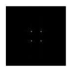
11.  CD5 (Chasys Draw Image)
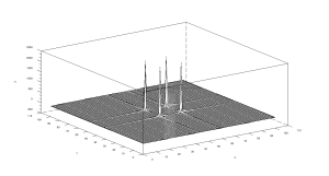
12.  FITS (Flexible Image Transport System)

13.  PGF (Progressive Graphics File)

Now let me proceed to discussing the specified procedure in the manual.  Here, I obtained information from my scanned image used in the first activity and see its properties using the imread, size, and imfinfo commands in scilab.  The copy of the scanned image and a Print screen image is shown below

Figure 8. Scanned Image fro Activity 1

Figure 9. Print Screen Image of the Scilab codes

Based from the size and from what the Scilab says, the scanned image is a truecolor image.

Let me now analyze and get the properties of some of my scanned images intended for this activity.            The next image is a scanned colored image of a leaf with a flower and the corresponding Printscreen image from the Scilab codes.

Figure 10. Scanned Colored Image

Figure 11. Print Screen Image of the scilab code

The scanned image is a truecolor image similar to the setting when it was scanned.  Let us now see if the scanned image was set to grayscale when it was scanned.  Shown below is a grayscale image with the Print screen code form Scilab.

Figure 12. Scanned Grayscale Image

Figure 13. Print Screen image of the Scilab code

It is still a truecolor image, hmmmm I guess it’s because it was exported to Scilab as it was saved and no image conversion was done like the scanned graph above.  It is, however, confirmed in GIMP.

Figure 14. Print Screen Image of the Image Properties from GIMP

I will now convert a true color image into grayscale and black and white using Scilab.  The image that I will be going to convert is a photo of Lady Gaga, a singer that I really really like :-).

Figure 15. Lady GaGa true color Image

https://5artychickens.wordpress.com/2010/02/20/top-fashion-buzz-of-2010/

Using the code

I=imread(‘C:\Users\RnR-\Documents\Rob\Images\Lady gaga True color.jpg’);

imshow(I);

G = im2gray(I);

imshow(G);

The image of GaGa was successfully converted into grayscale as shown below

Figure 16. Lady GaGa grayscale image

Then using the code below with 0.5 threshold value for the pixel color to turn black or white depending if it exceed or less than the threshold.  The selection of the threshold value here is completely arbitrary, I just chose 0.5 since it’s on the middle 0f 0 and 1.

I=imread(‘C:\Users\RnR-\Documents\Rob\Images\Lady gaga True color.jpg’);

imshow(I);

G = im2bw(I,0.5);

imshow(G);

Figure 17. Lady GaGa Black and White Image

GaGa is now black and white!

Well, I can say that the threshold value was not that ok since some parts of the Region of Interest (ROI) is not distinguishable from the background.  However, this is only a preliminary demonstration of the Scilab’s capability of converting images.  The succeeding discussions will deal more on the thresholding.

Using  histplot(256,I) on the grayscale image of my scanned plot a histogram plot was made.

Figure 17. Histplot of the grayscale image of the scanned plot

The histogram shows that the scanned image is of poor contrast since the plot is just concentrated on an area.  To plot the scanned graph on a black and white mode, I chose a threshold point from the histplot above.  I actually do some trial and error in doing this, and finally I chose 0.96. The threshold is important to distinguish the Region of Interest (ROI) from the background. The black and white image is shown below with the print screen of the Scilab codes.

Figure 18. Black and white image of the scanned plot with threshold of 0.96

The lines, I think, were separated from the background. However, there is a large black area on the image that is a reflection of the poor quality of the scanned image.

Since I am not happy with the contrast of my scanned graph, let me try using my scanned image of the leaf and the flower and do the same concept in doing the black and white image.

The grayscale image is shown below

Figure 19. Grayscale image converted from the scanned colored image from Figure 10

Now for the histplot…

Figure 20. Histplot of the grayscale image above

Now I can say that I have obtained a scanned image of high contrast as shown by the more distributed plot. 🙂 So for the the black and white image, the threshold was set to 0.7 (not too light, not too heavy). The black and white image is shown below

Figure 21. Black and white image of the scanned Leaf and flower (at llast-my Final Image for this blog)

For this image, I can say that the ROI is already well-distinguished from the background.

There there…I think I’ve done all the required things to do on this activity.  I rate myself 10/10 for doing all the required things to do [and even slightly exceeding]. I acknowledge Xylene Azurin for helping me with the histplot. Thank you very much, Xy

References:

  1. Binary Images. http://homepages.inf.ed.ac.uk/rbf/CVonline/LOCAL_COPIES/OWENS/LECT2/node3.html
  2. Grayscale Images. http://homepages.inf.ed.ac.uk/rbf/HIPR2/gryimage.htm
  3. Indexed images  http://www.cylekx.net/help/indexed_images.htm
  4. Image File Formats – TIF, JPG, PNG, GIF. Which to use? http://www.scantips.com/basics09.html
  5. Image File Formats. http://en.wikipedia.org/wiki/Image_file_formats